
Story
Psychology
Data
Story
UI
Prototyping
Data
" height="24.9756px" id="DGG5xKro3" width="85px"/></g></g></svg>)
Gymone is a Swiss-based fitness center that provide local premium fitness services.
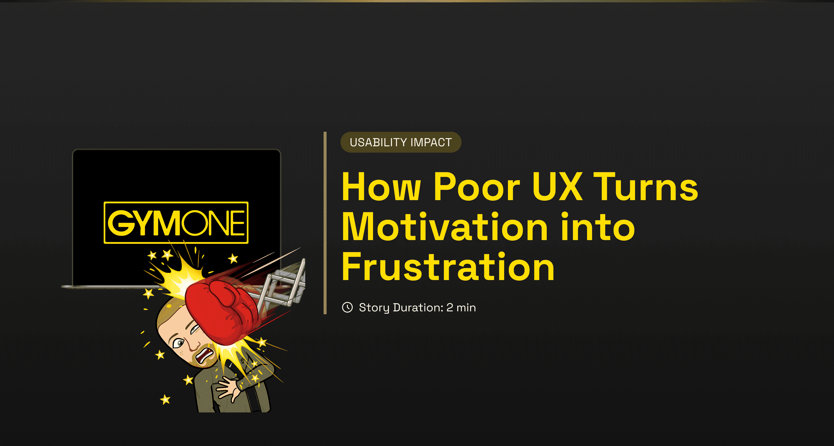
Re-design Gymone’s key features and improve website usability.
Results
From 0% to 100% booking class completion rate
26 out of 26 solved usability issues
From 1 to 3 new user flows
Team
Alessio Cerquiglini
Duration
2 months
Re-design Gymone’s key features and improve website usability.
Results
From 0% to 100% booking class completion rate
26 out of 26 solved usability issues
From 1 to 3 new user flows
Team
Alessio Cerquiglini
Duration
2 months
Problem
Problem
Research
Research
Heuristic Evaluation
An initial evaluation revealed 26 usability issues across Gymone’s core website functions: class booking, membership purchase and membership management. Four most impactful findings were:
Heuristic Evaluation
An initial evaluation revealed 26 usability issues across Gymone’s core website functions: class booking, membership purchase and membership management. Four most impactful findings were:
1 Critical
11 Major
1 Minor
1 Positive
27 Findings
27 Findings
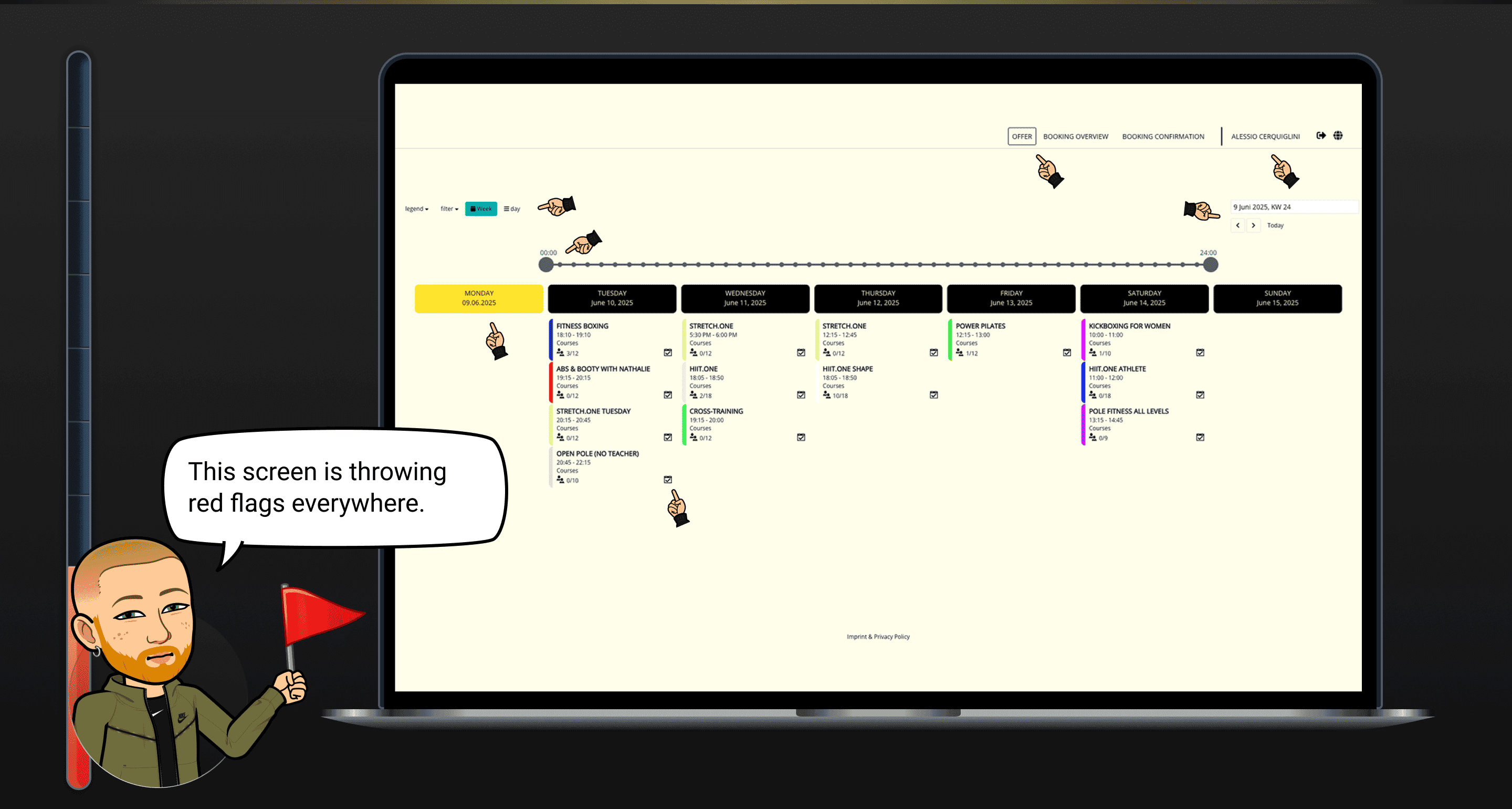
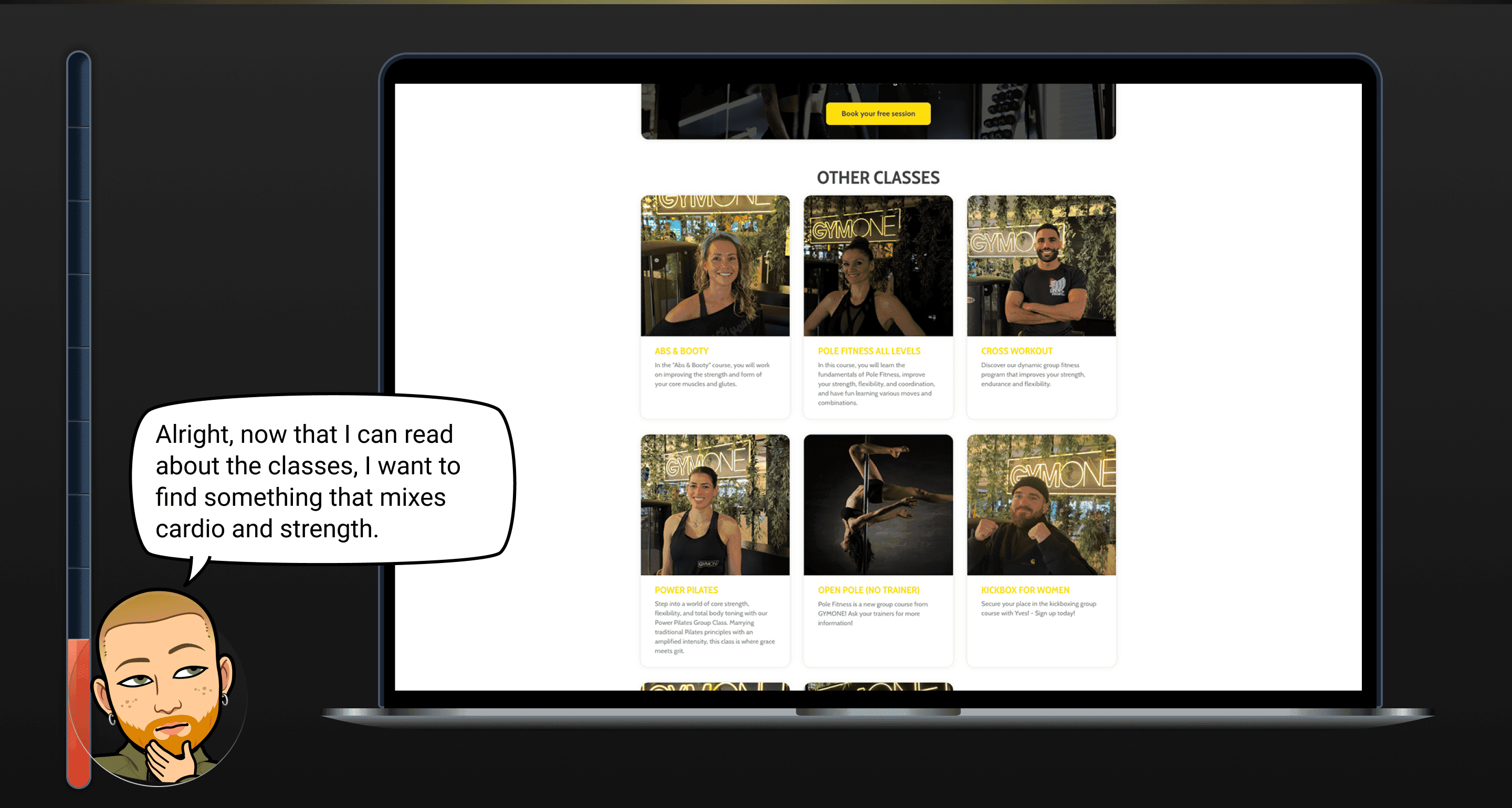
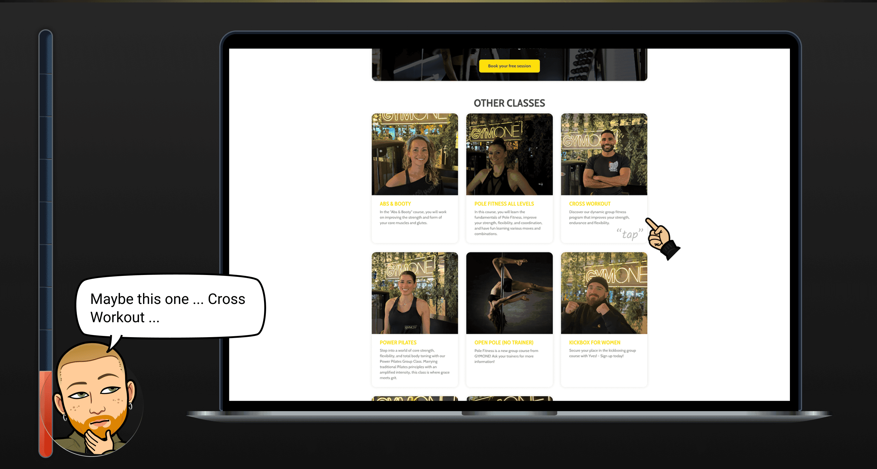
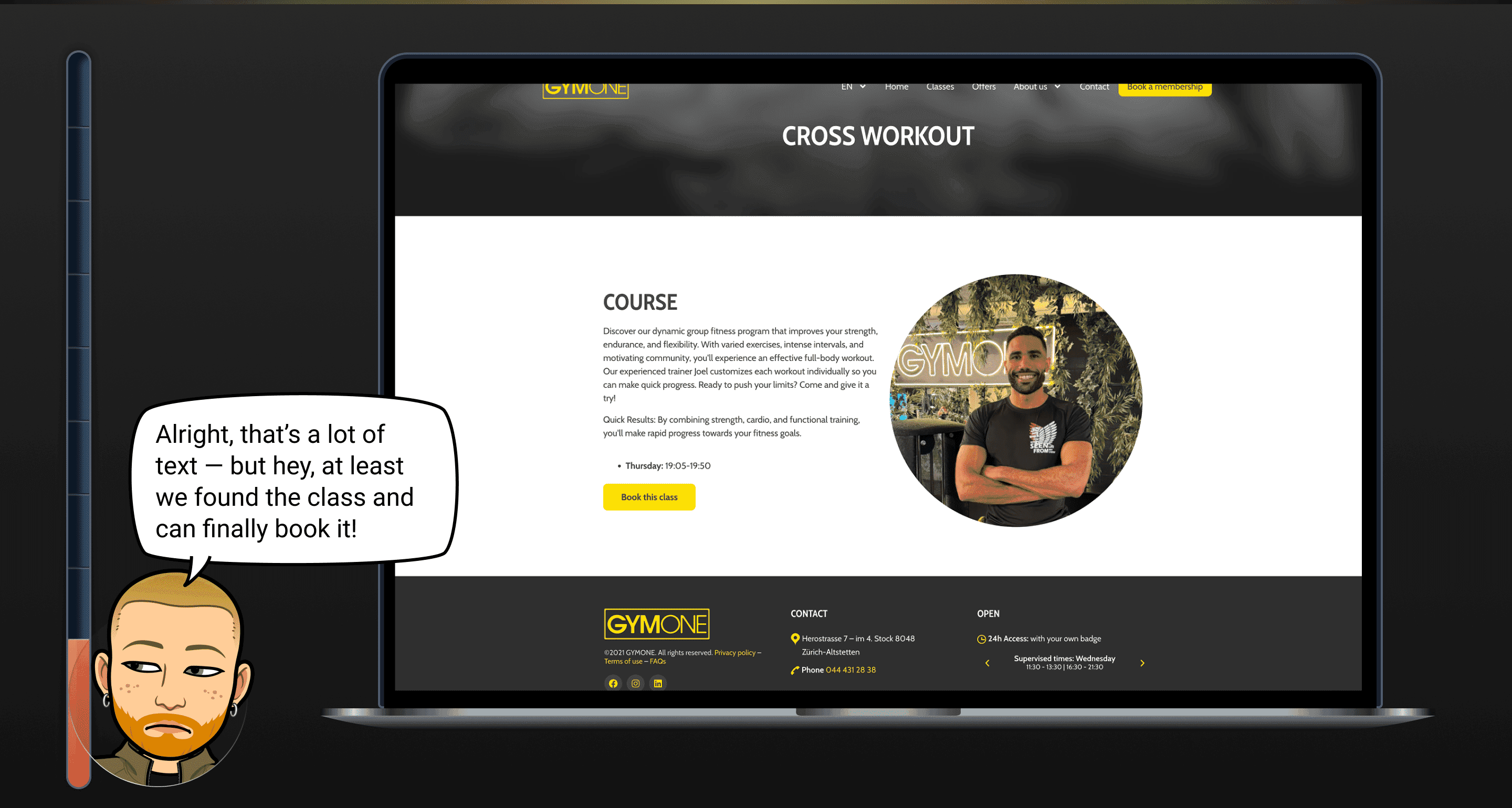
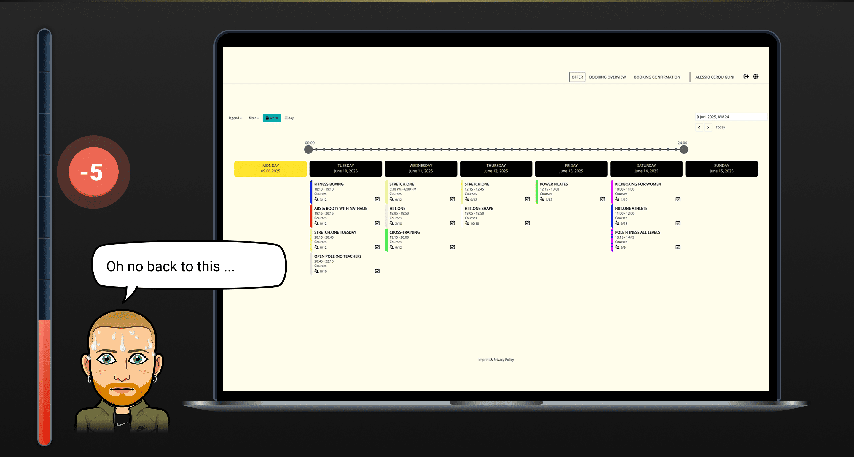
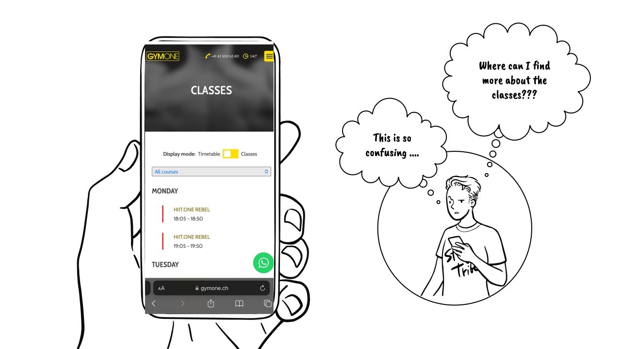
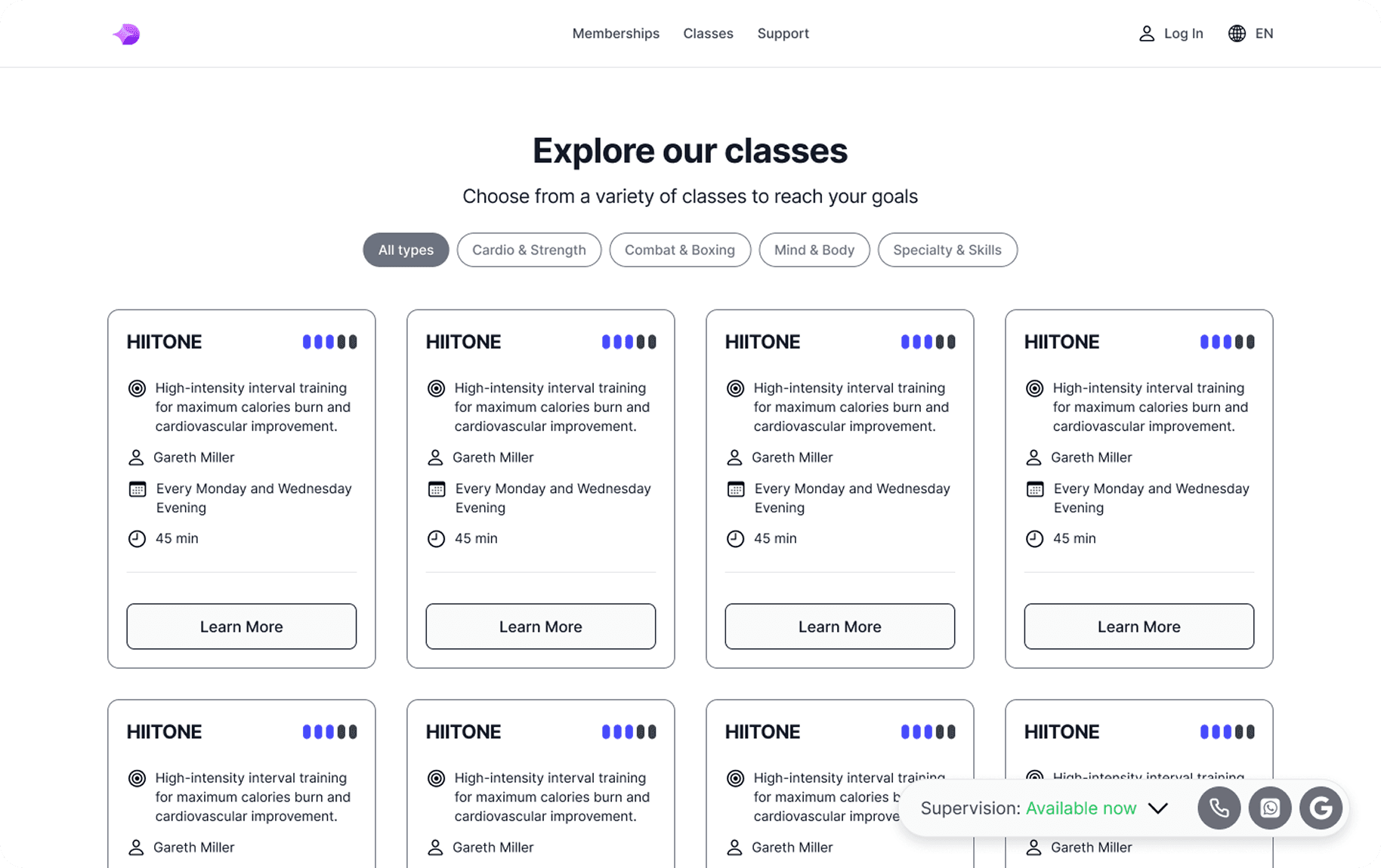
Booking a class
Critical
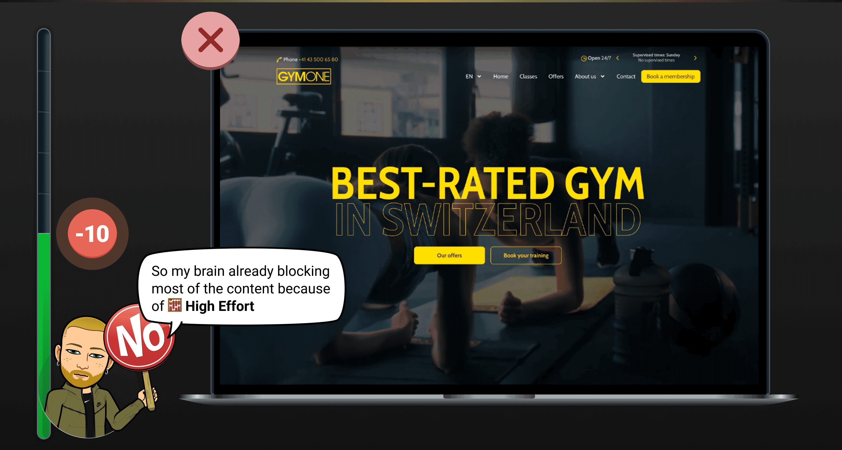
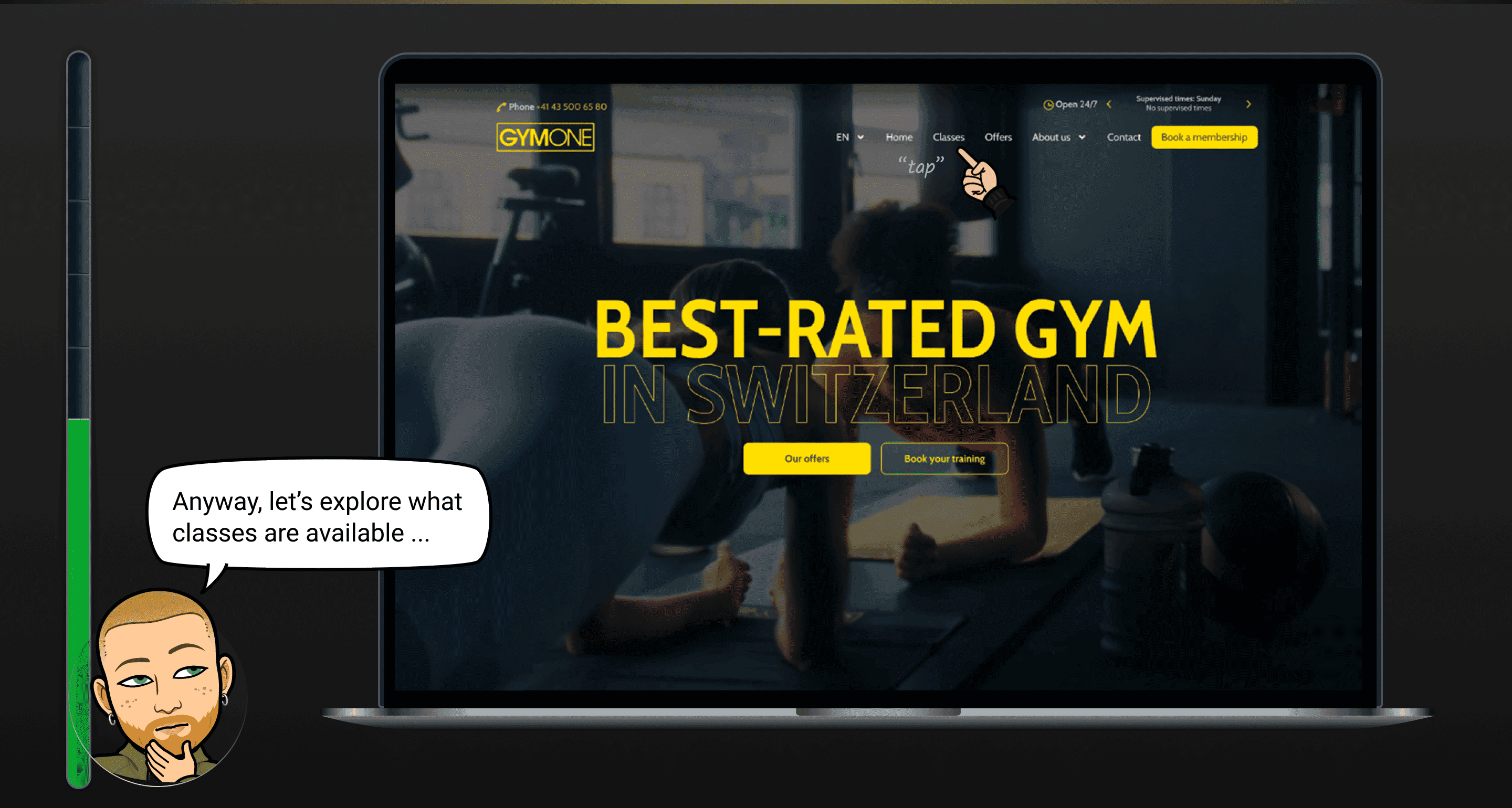
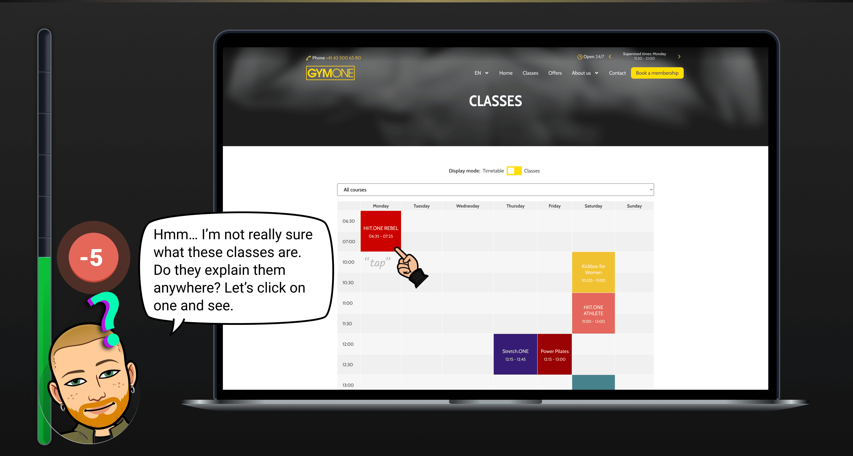
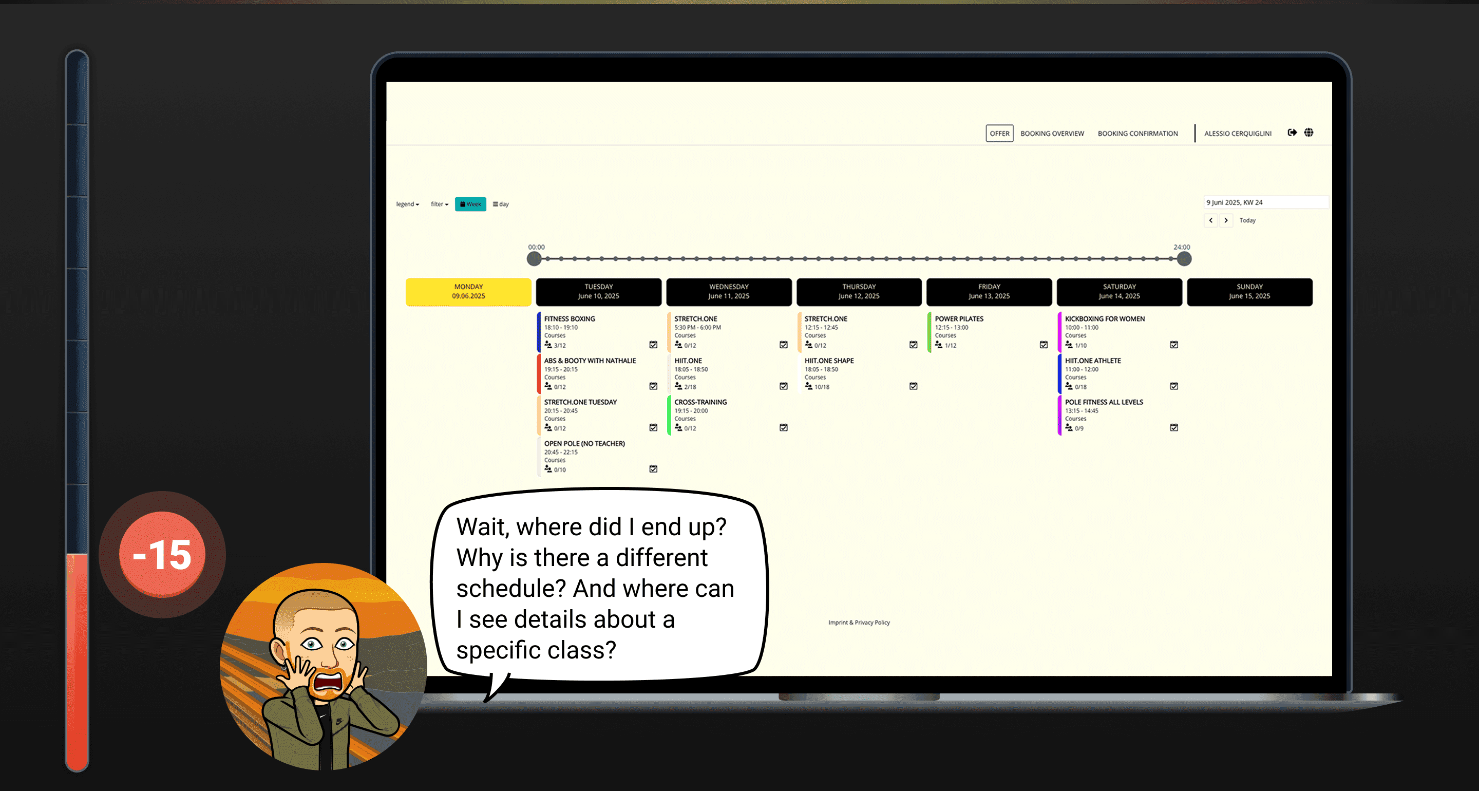
Users are unable to complete the class booking process due to an unclear login flow and struggle to locate information about available classes.
Booking a class
Critical
Users are unable to complete the class booking process due to an unclear login flow and struggle to locate information about available classes.
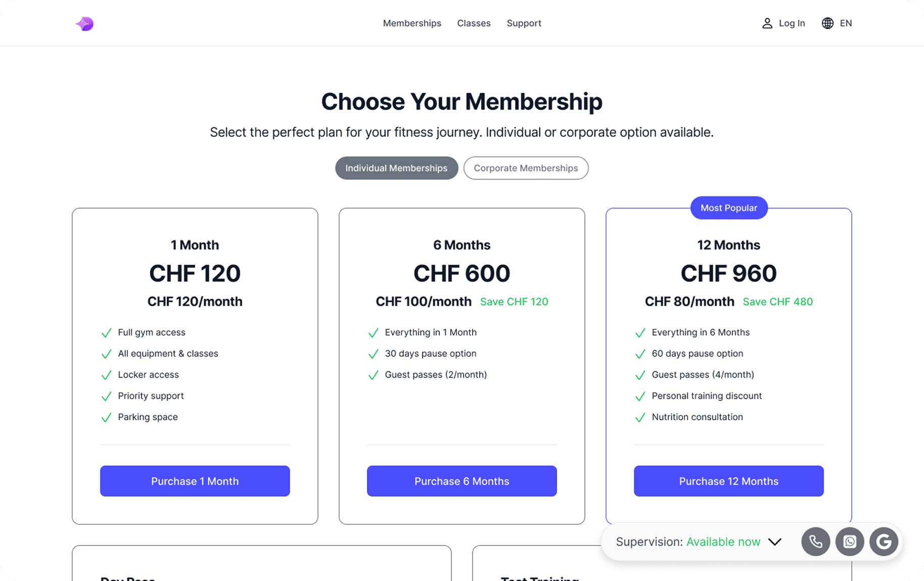
Purchase a membership
Major
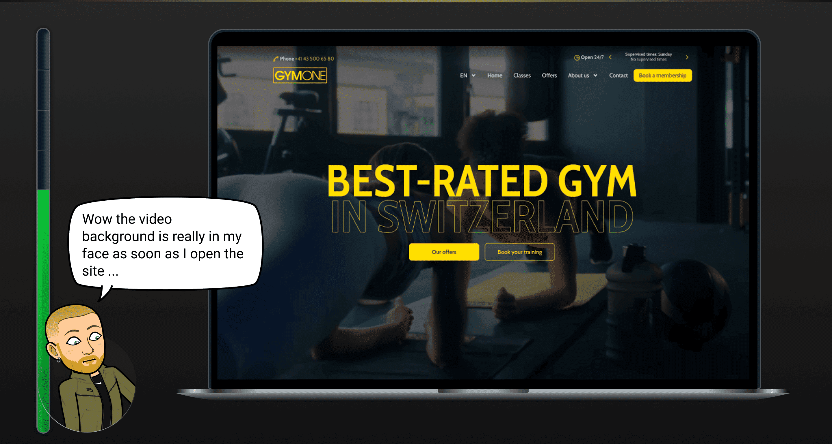
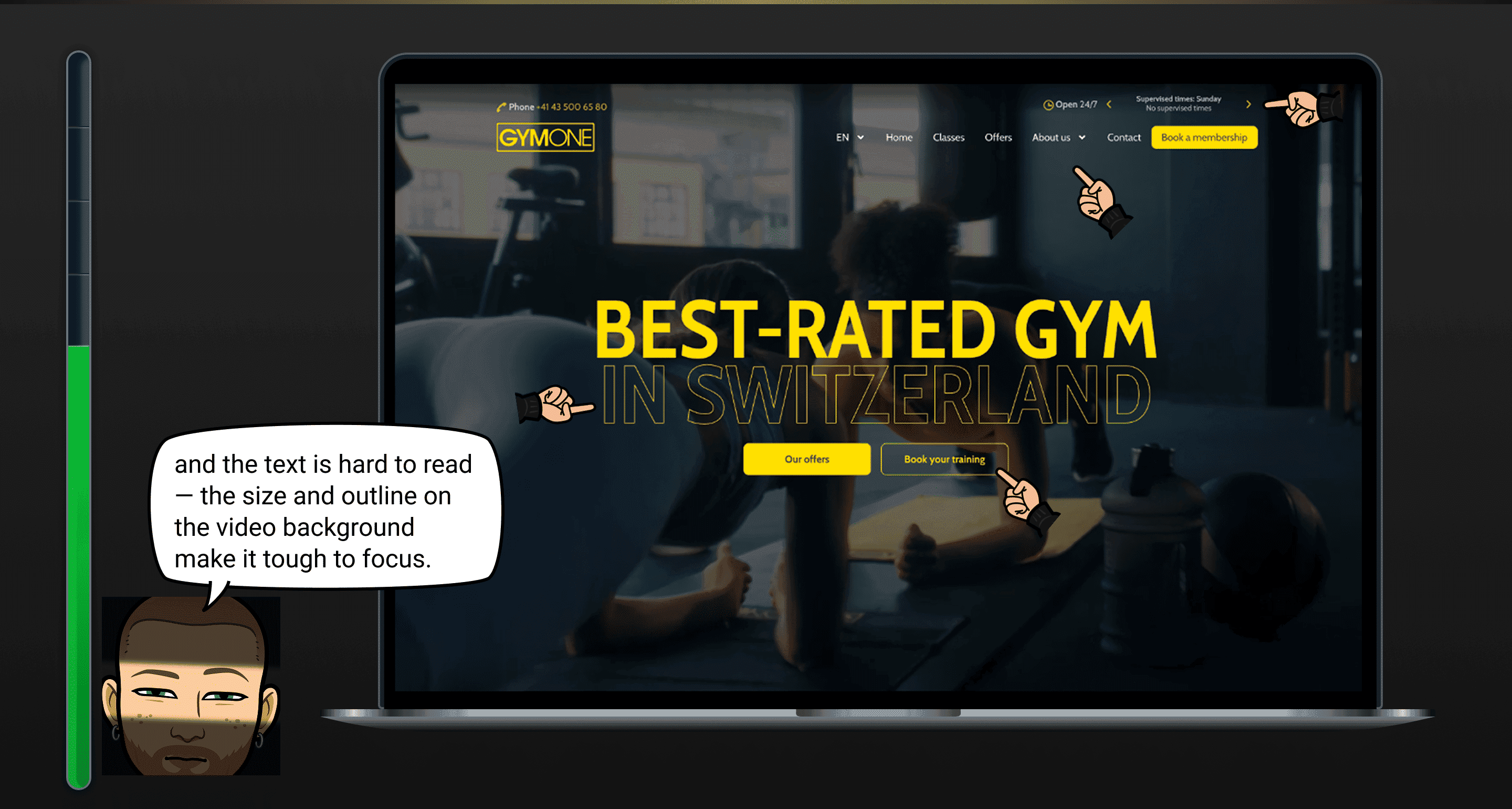
The homepage fails to clearly communicate the gym’s benefits and lacks social proof, making it harder for users to trust the brand.
Purchase a membership
Major
The homepage fails to clearly communicate the gym’s benefits and lacks social proof, making it harder for users to trust the brand.
Manage membership
Critical
The website doesn’t allow member to manage their membership. User can’t cancel their membership within the website.
Manage membership
Critical
The website doesn’t allow member to manage their membership. User can’t cancel their membership within the website.
Manage membership
Critical
The website doesn’t allow member to manage their membership. User can’t cancel their membership within the website.
General UX
Major
Both key flows redirect users to external sites that do not support English. Given that over 50% of members are non-German speakers, this significantly harms accessibility.
General UX
Major
Both key flows redirect users to external sites that do not support English. Given that over 50% of members are non-German speakers, this significantly harms accessibility.
Usability Testing
After forming my initial assumptions, I wanted to validate whether the identified issues truly affected the user experience. To do so, I designed a usability testing strategy that started with a pre-test survey to gather insights about participants’ demographics, lifestyle, fitness habits and digital behaviour. The usability test itself consisted of three main tasks:
Purchase a membership
Purchase a membership
Book a live class
Book a live class
Manage your membership
Manage your membership
Participant Overview
2 members (live session)
3 new users (online session)


A special thanks to Thierry, Karolina, Chiara, Pascal and Nicholas for the time and help by participating in the usability test.
Most relevant findings from the usability test
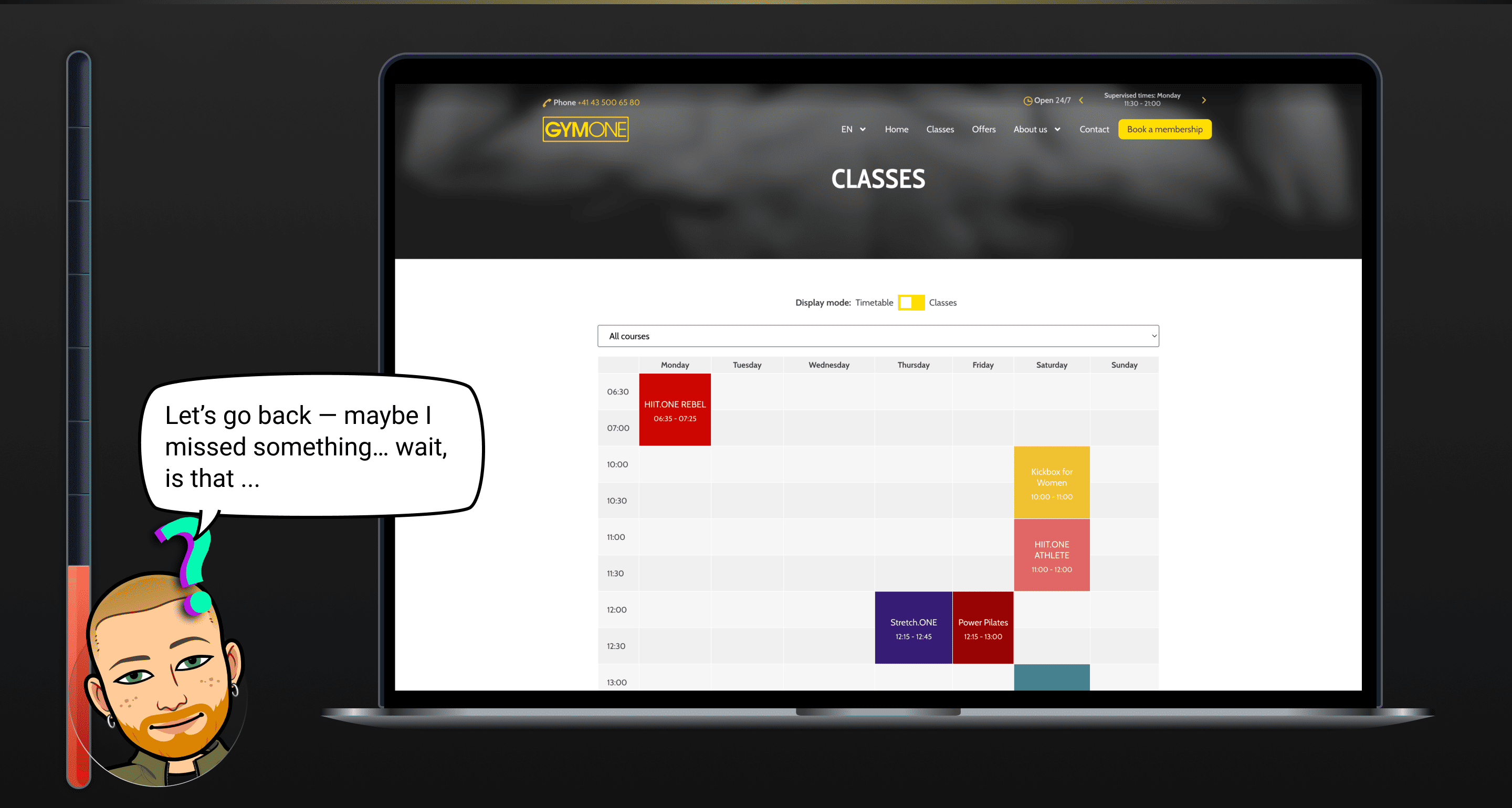
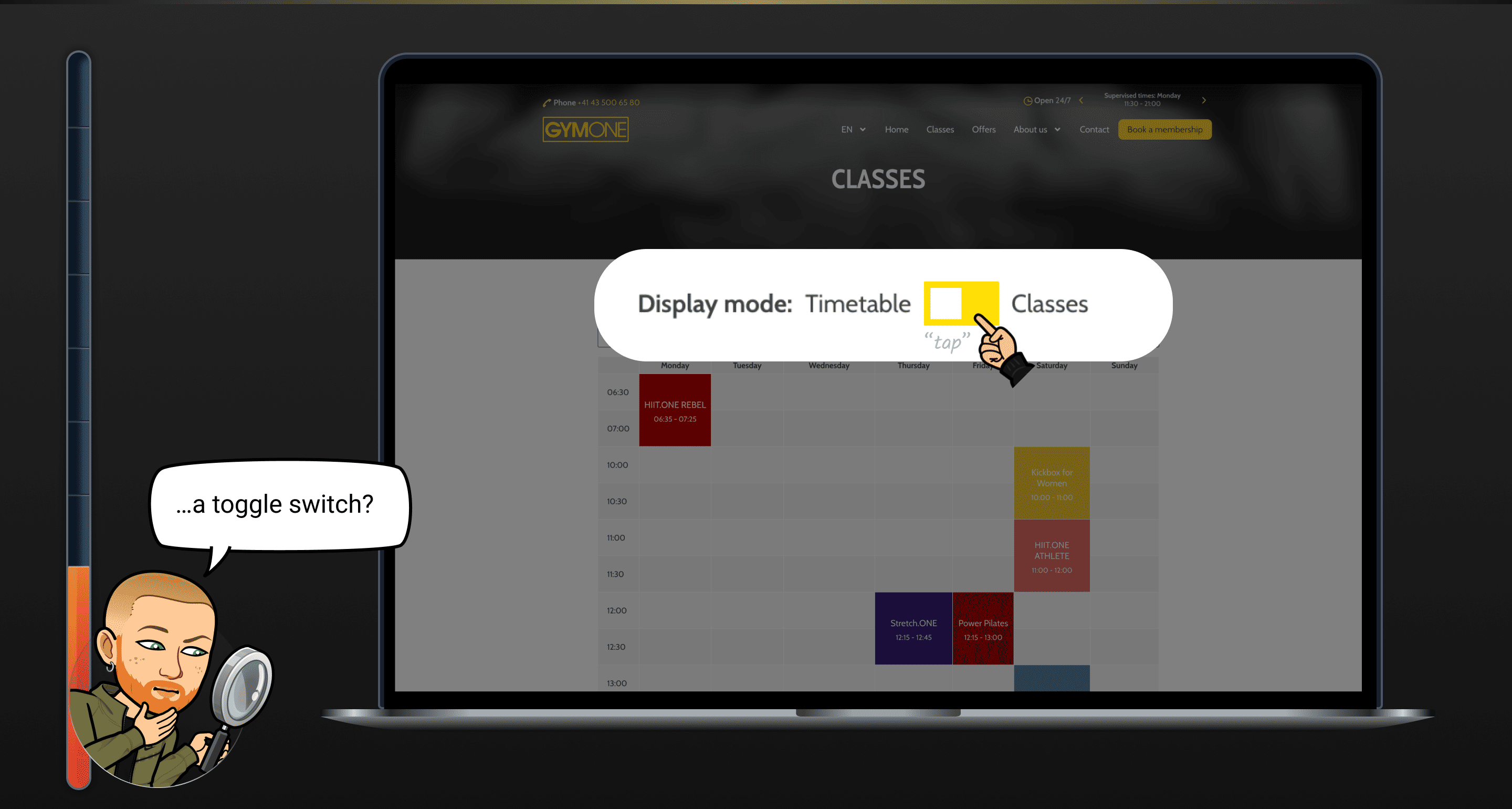
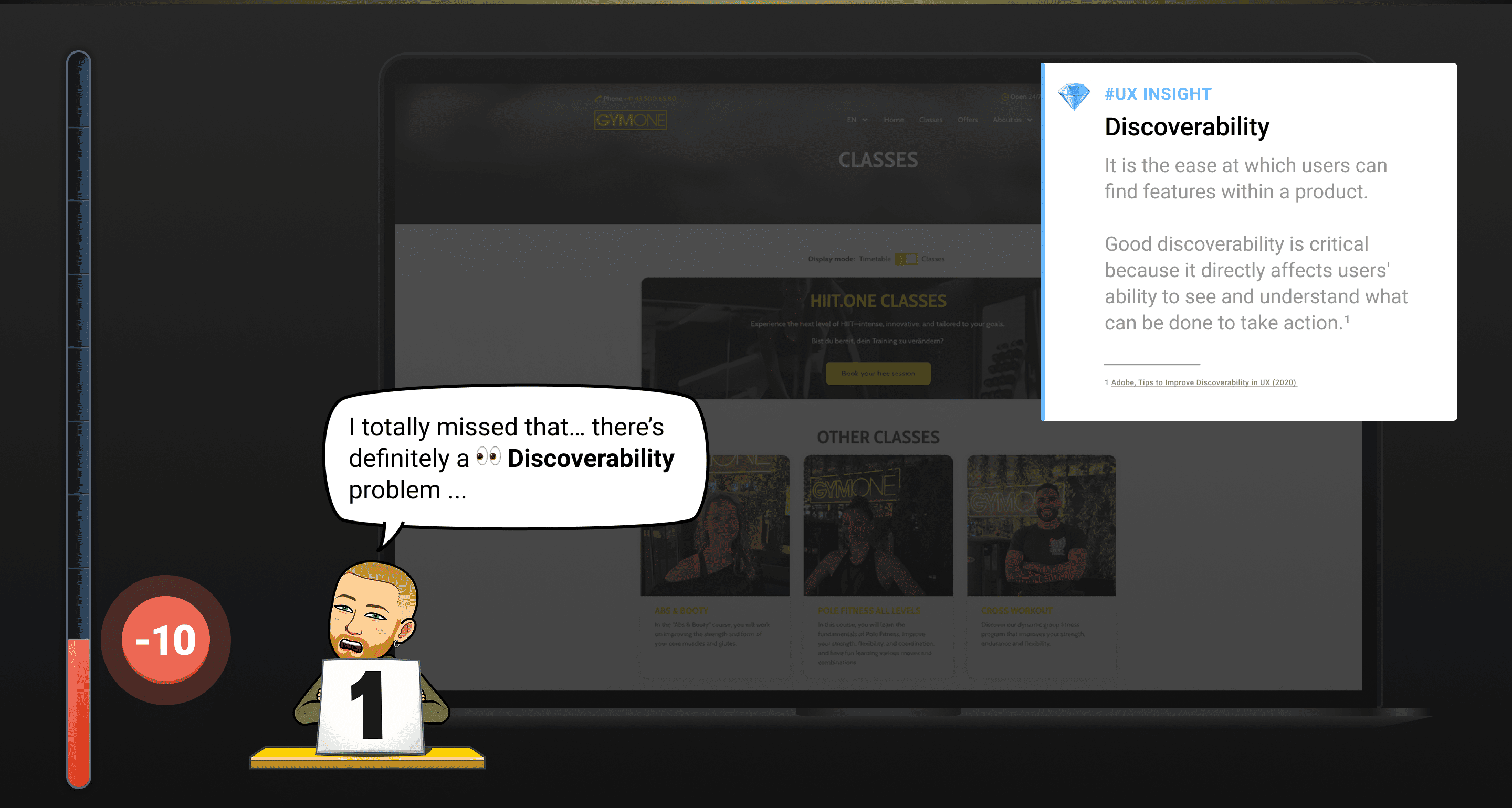
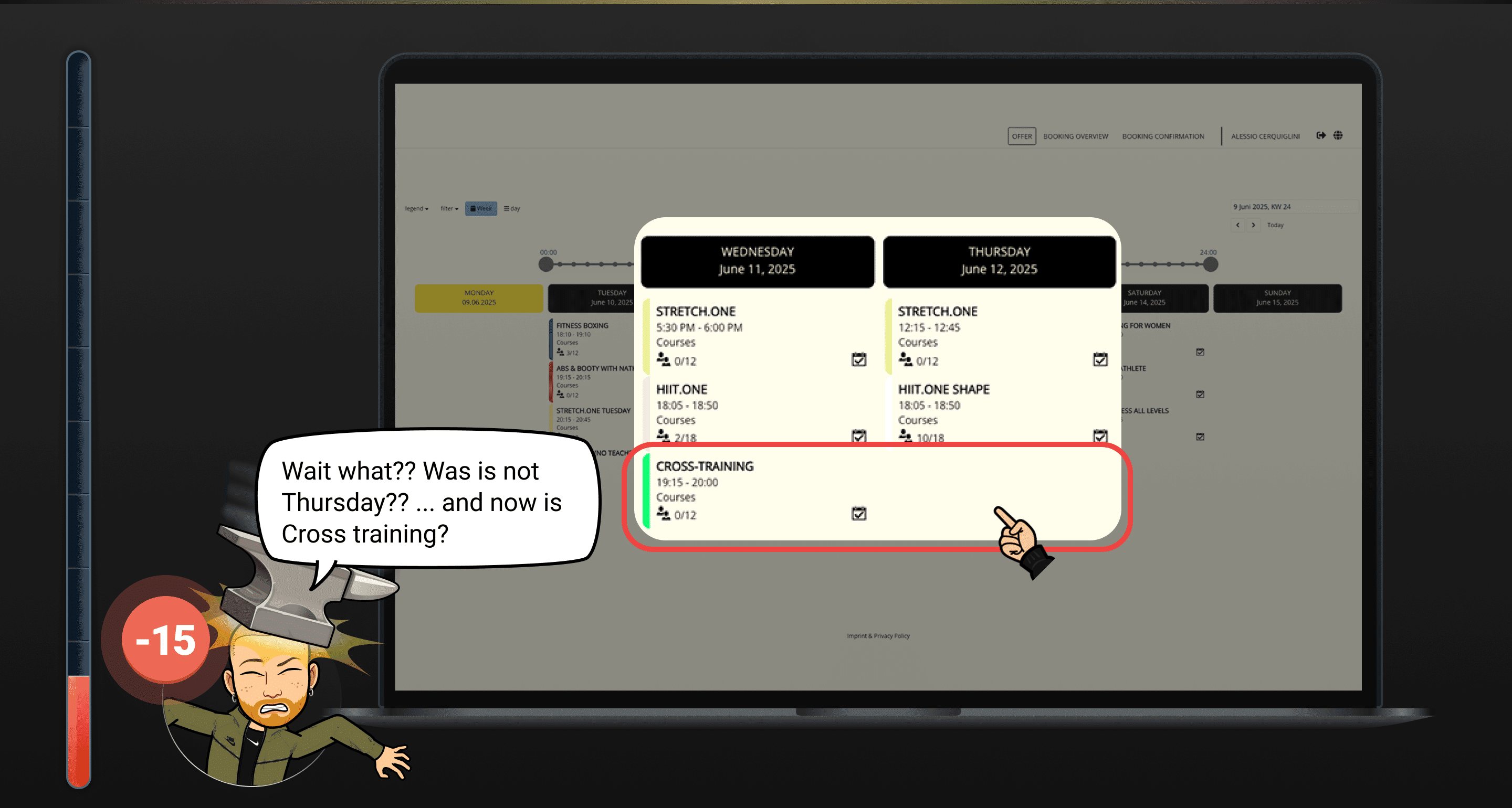
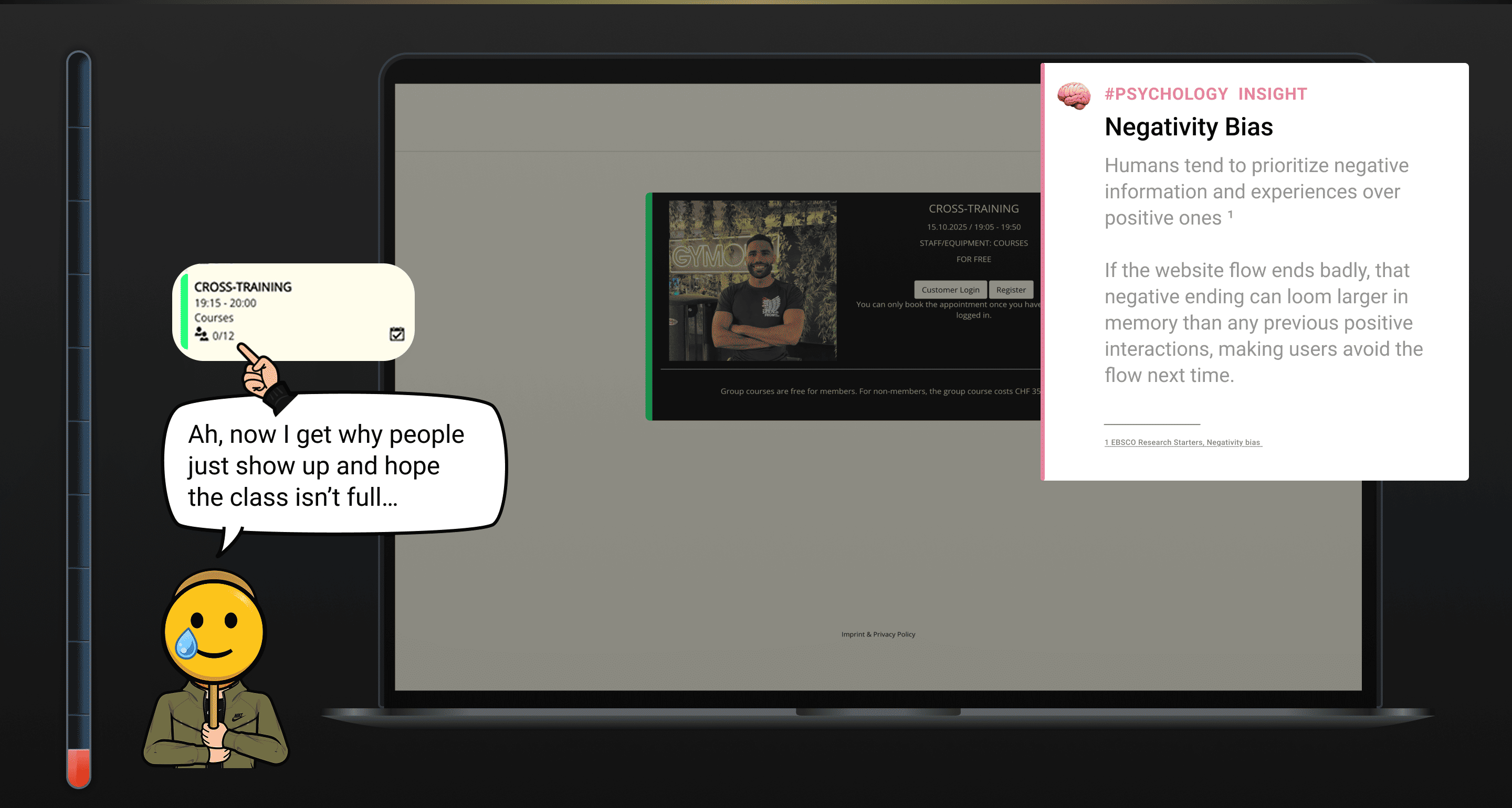
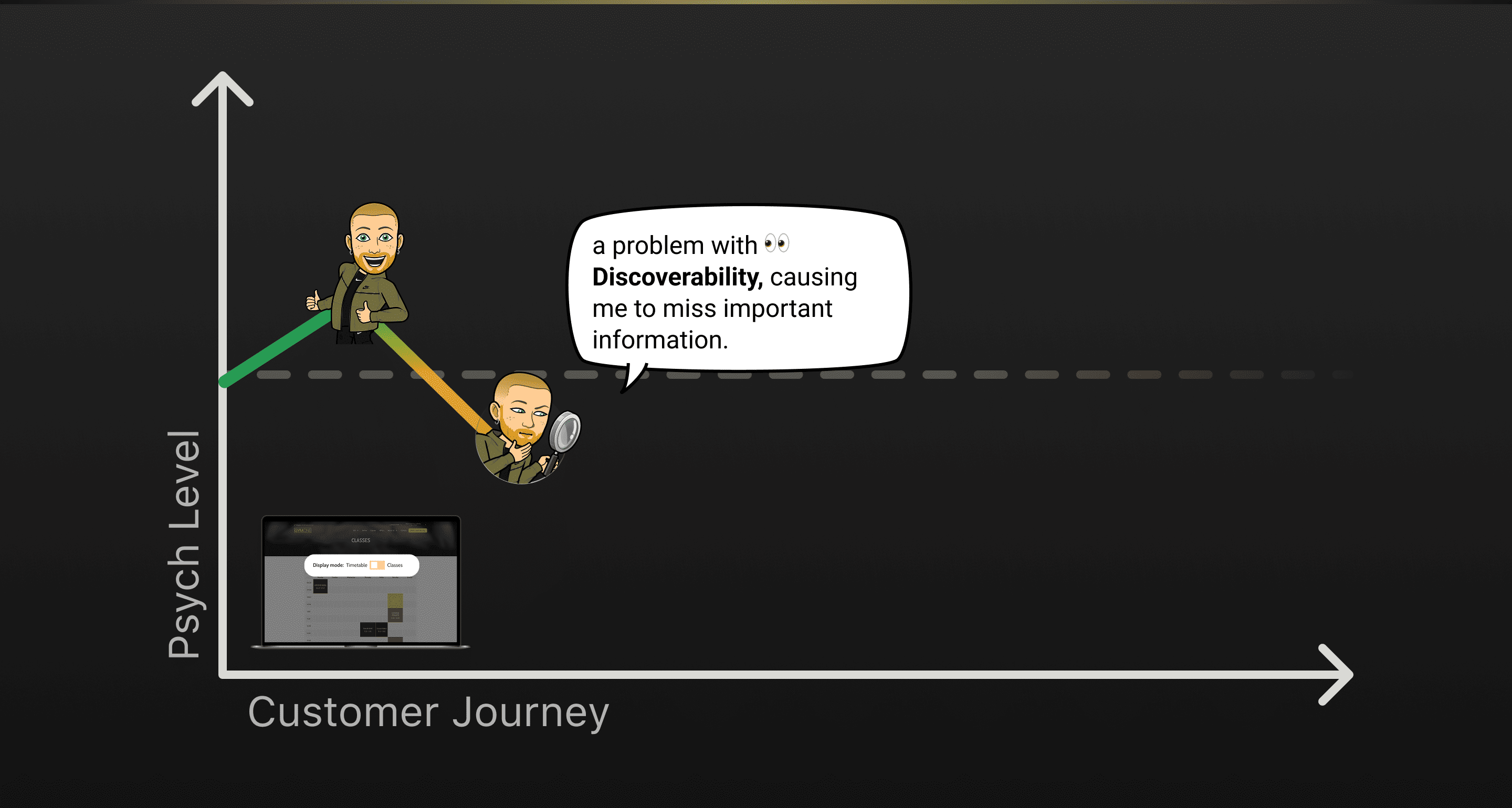
Discoverability Problem
It was observed that 5 out of 5 participants could not find information about available classes. This means that users lack access to essential class details, which prevents them from exploring offerings and booking.
Discoverability Problem
It was observed that 5 out of 5 participants could not find information about available classes. This means that users lack access to essential class details, which prevents them from exploring offerings and booking.
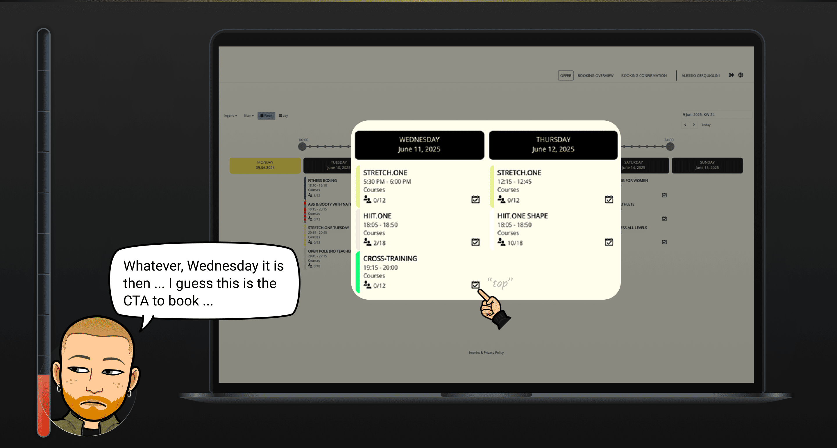
Broken Flow
It was observed that 5 out of 5 participants dropped off when trying to book a class. This means that the booking process is highly problematic and does not support successful completion.
Broken Flow
It was observed that 5 out of 5 participants dropped off when trying to book a class. This means that the booking process is highly problematic and does not support successful completion.
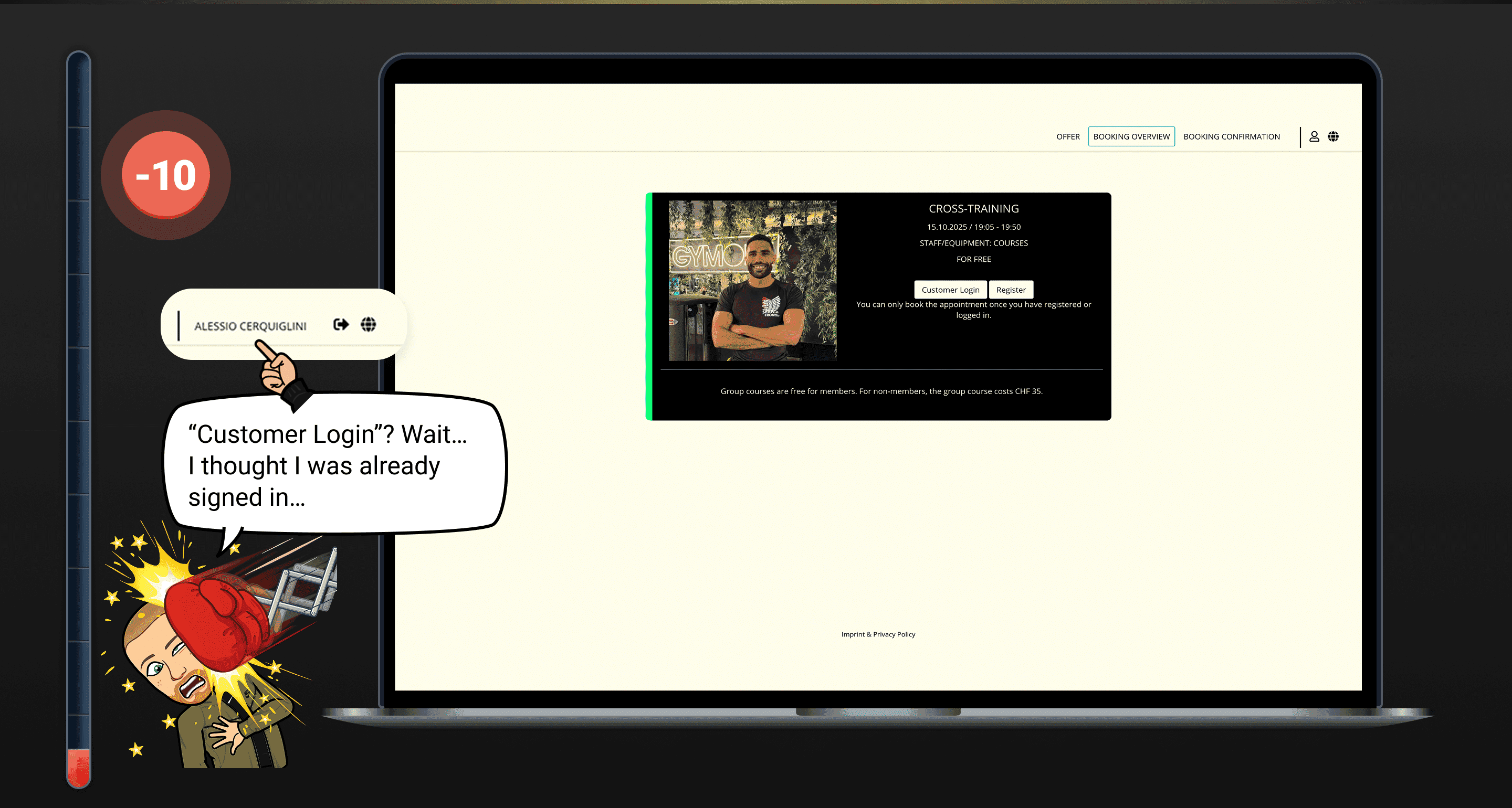
Missed Expectation
It was observed that 5 out of 5 participants were looking for a log in section were they could cancel their membership and manage their bookings.
Missed Expectation
It was observed that 5 out of 5 participants were looking for a log in section were they could cancel their membership and manage their bookings.
Language Barrier
It was observed that 3 out of 3 non speaking german participants preferred English as the default for the website, emails, and documents. This means that language inconsistency (German/English) creates friction and may discourage non-German speakers.
Language Barrier
It was observed that 3 out of 3 non speaking german participants preferred English as the default for the website, emails, and documents. This means that language inconsistency (German/English) creates friction and may discourage non-German speakers.
Positive Finding
It was observed that 2 participants positively mentioned the 3D tour and premium colours. This means that certain design elements are perceived as engaging and could be emphasised further.
Positive Finding
It was observed that 2 participants positively mentioned the 3D tour and premium colours. This means that certain design elements are perceived as engaging and could be emphasised further.
“I don’t really understand what these classes are about and I would never book”
“I don’t really understand what these classes are about and I would never book”
Chiara, during usability test
Research Results
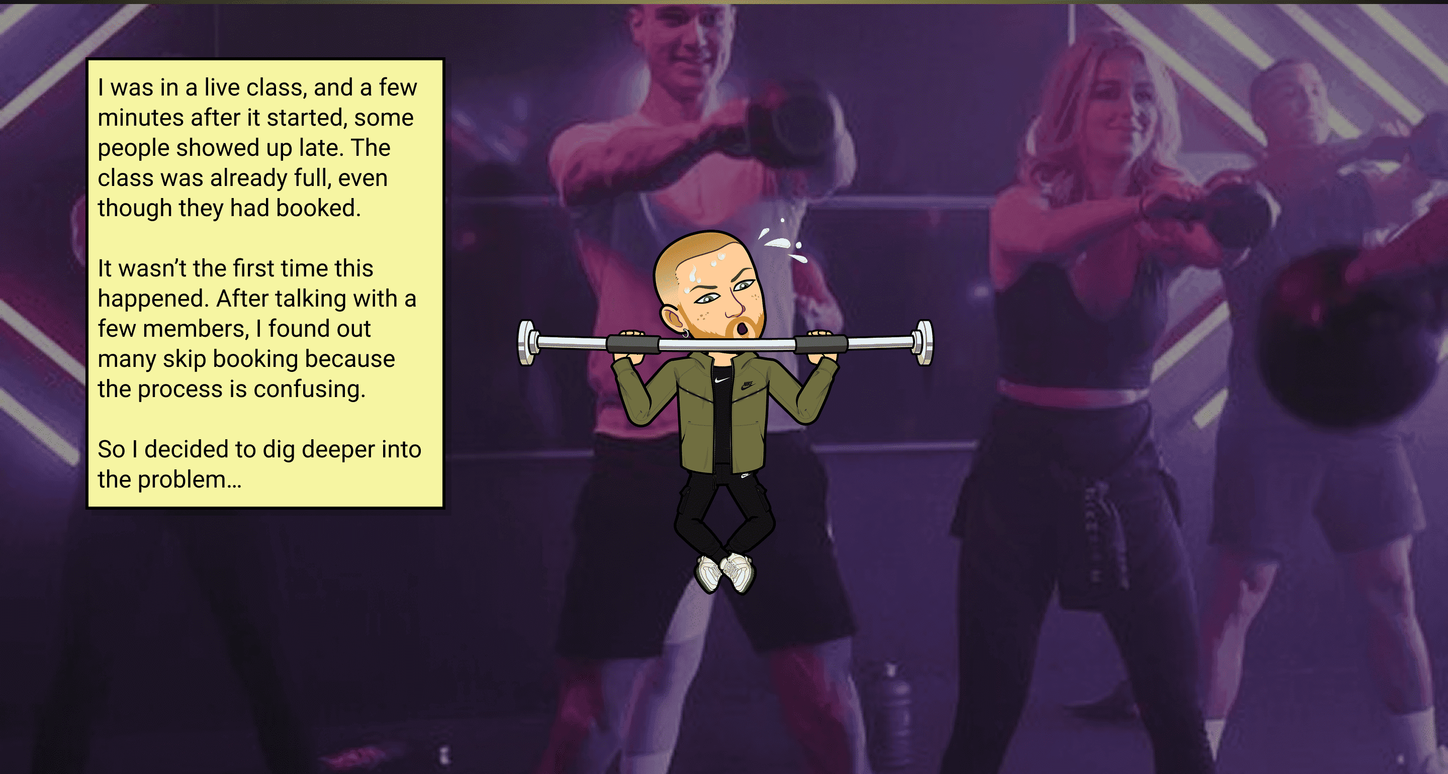
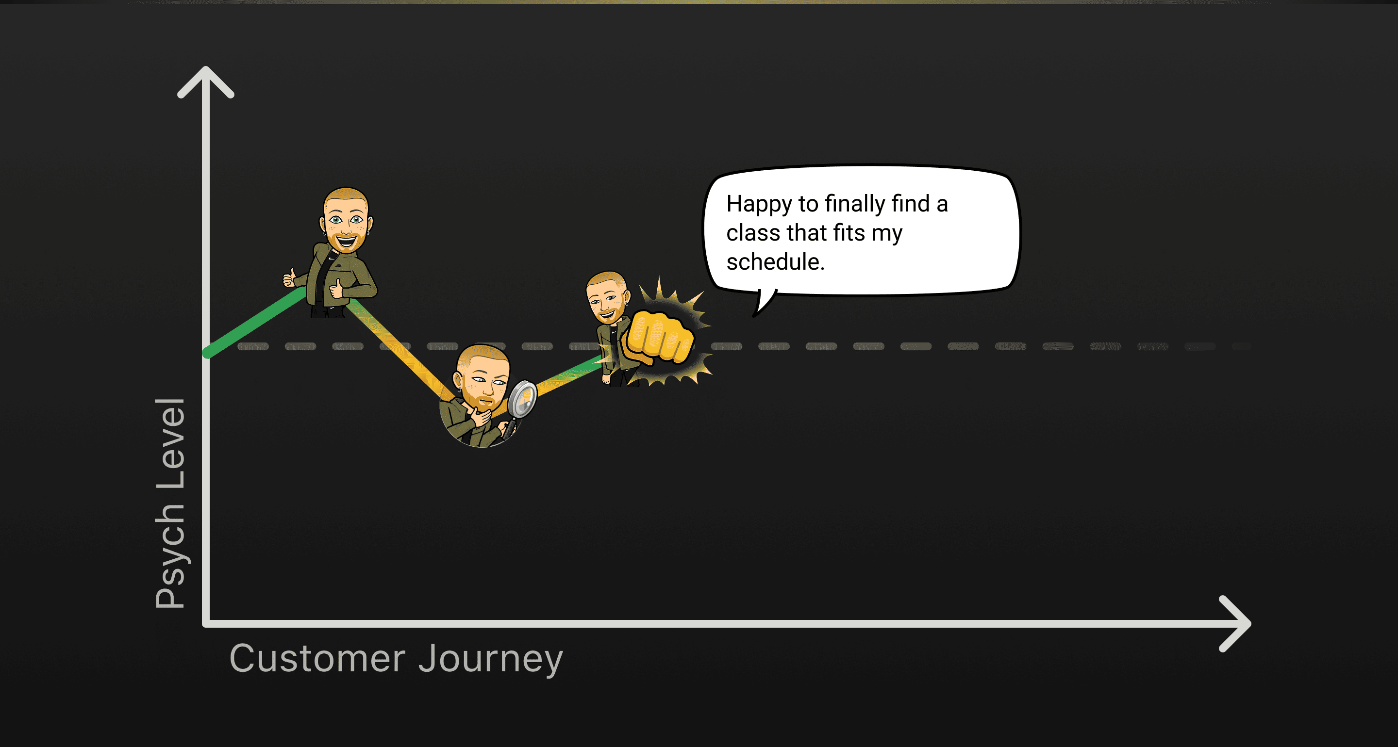
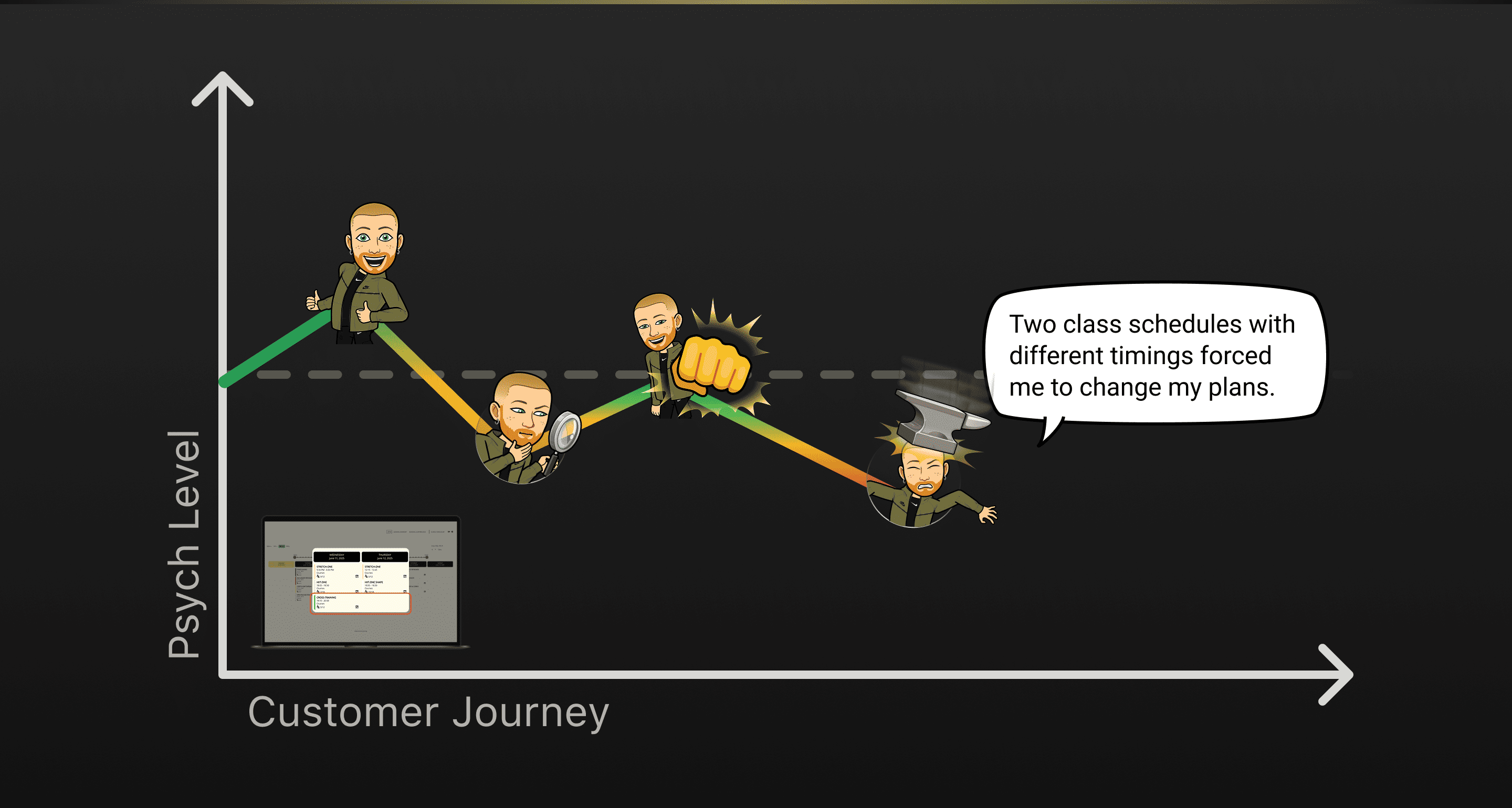
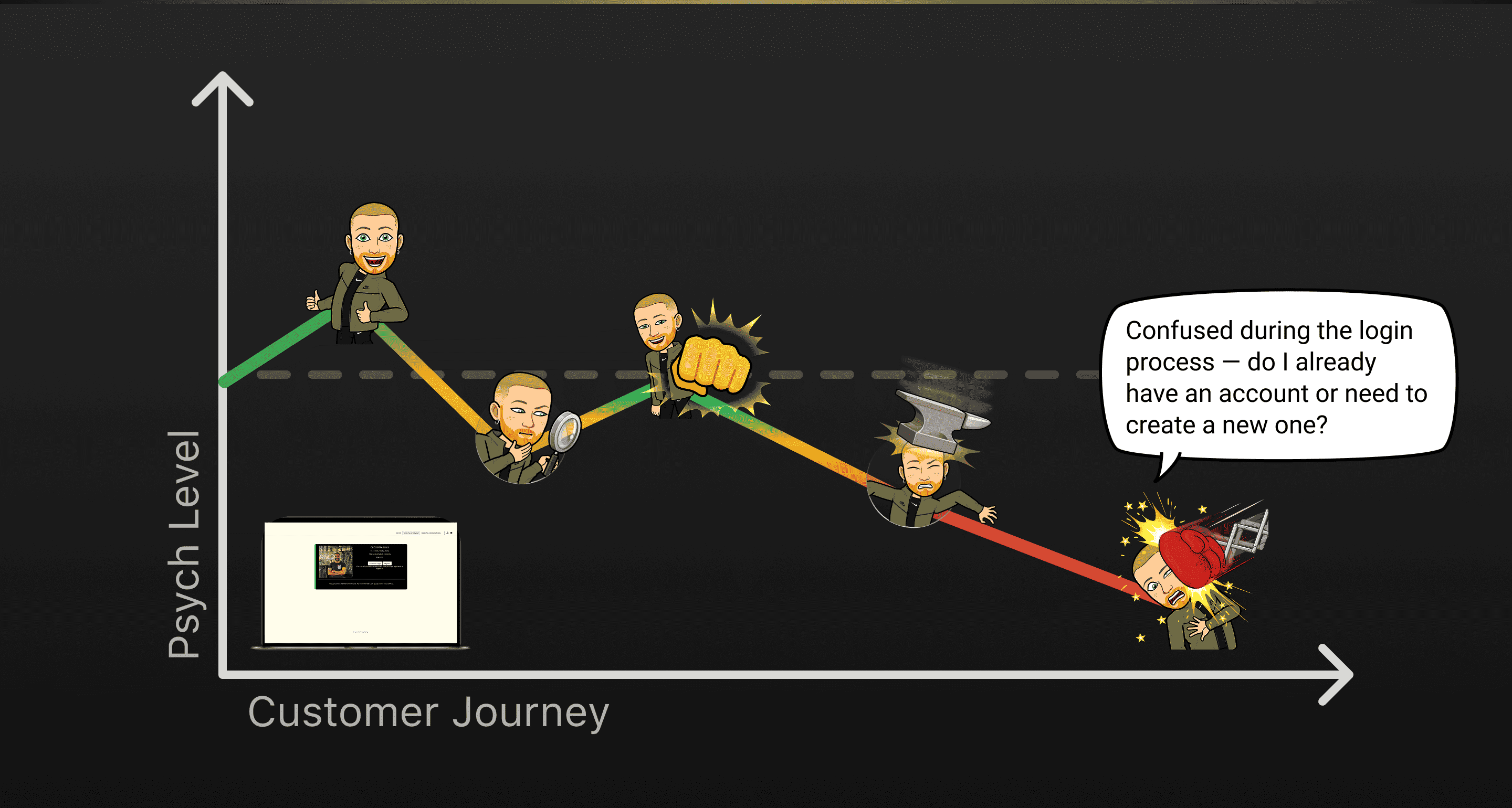
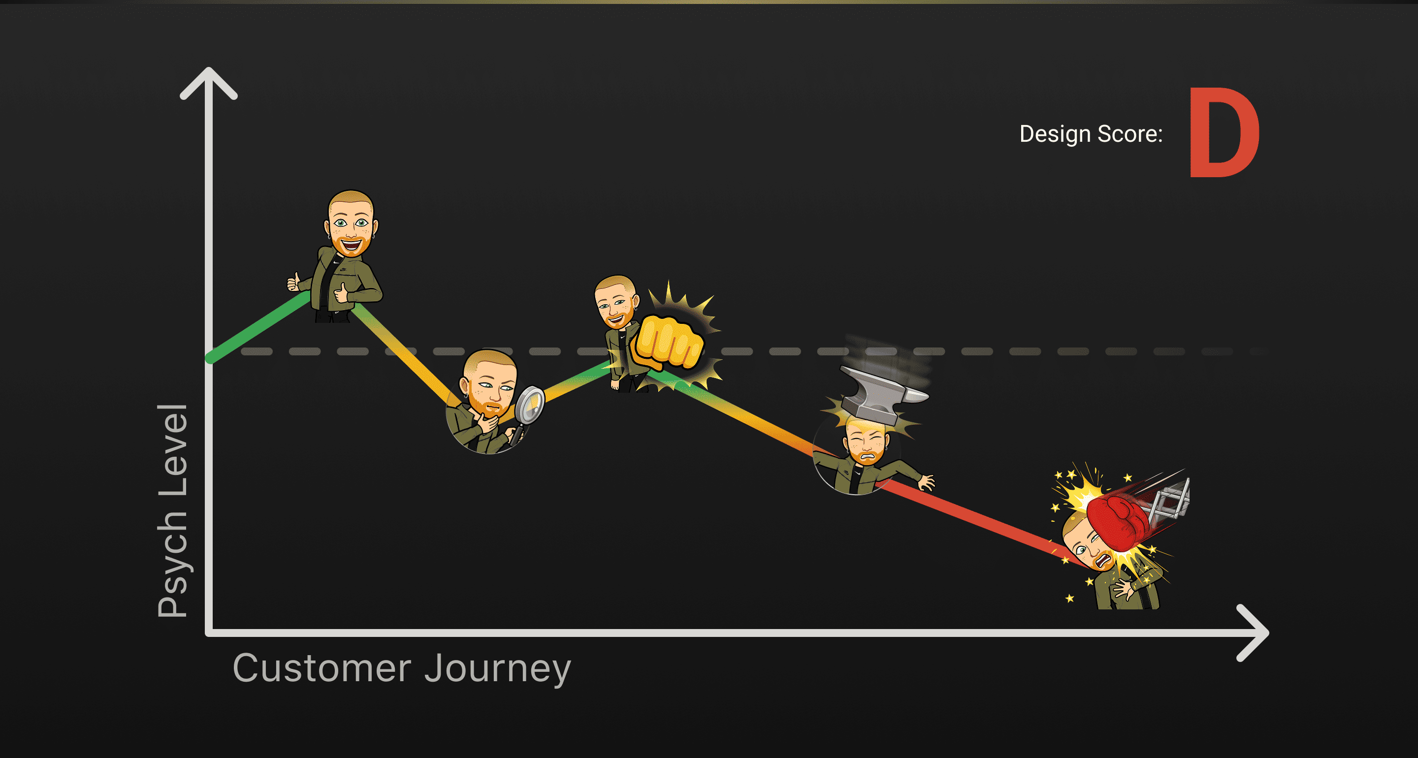
After analysing all the findings, it became clear that the system had serious usability issues causing users to drop off when trying to book a class. This directly explained why many people ended up showing up to classes without a booking, hoping for a free spot. Exactly the issue I noticed at the beginning of the project.
Research Results
After analysing all the findings, it became clear that the system had serious usability issues causing users to drop off when trying to book a class. This directly explained why many people ended up showing up to classes without a booking, hoping for a free spot. Exactly the issue I noticed at the beginning of the project.
The research also revealed several problems for new users, especially when considering Gymone as their next gym. The value proposition wasn’t clear. The benefits of joining were either missing or poorly positioned. The social proof (like testimonials or community highlights) was weak or misplaced. The membership prices were confusing and not presented intuitively.
The research also revealed several problems for new users, especially when considering Gymone as their next gym. The value proposition wasn’t clear. The benefits of joining were either missing or poorly positioned. The social proof (like testimonials or community highlights) was weak or misplaced. The membership prices were confusing and not presented intuitively.
Another major gap was the absence of a profile section where members could manage their membership. For instance, to cancel a membership, users currently have to send a physical letter, which is outdated and frustrating.
Another major gap was the absence of a profile section where members could manage their membership. For instance, to cancel a membership, users currently have to send a physical letter, which is outdated and frustrating.
Additionally, key parts of the experience such as booking a class or purchasing a membership redirected users to external platforms that didn’t support English, making the process even harder for non-German speakers.
Additionally, key parts of the experience such as booking a class or purchasing a membership redirected users to external platforms that didn’t support English, making the process even harder for non-German speakers.
Main Challenge
The redesign needed to fix the two core flows: booking a class and purchasing a membership, while introducing a new member profile section for managing bookings and memberships.
The redesign needed to fix the two core flows: booking a class and purchasing a membership, while introducing a new member profile section for managing bookings and memberships.
Ideation
Ideation
Persona
Persona

Micheal
Gymone member
JTBD
His goal is to try a new class, because he has a limited time for his day and can’t complete his weight workout.
Micheal
Gymone member
JTBD
His goal is to try a new class, because he has a limited time for his day and can’t complete his weight workout.

Aika
New potential member
JTBD
Her goal is to find the right gym after moving to a new city. Her second goal is to cancel the membership as she will need to relocate somewhere else.
Aika
New potential member
JTBD
Her goal is to find the right gym after moving to a new city. Her second goal is to cancel the membership as she will need to relocate somewhere else.
Scenario
Booking a Class
Becoming a Member
Cancel the Membership
Driving at work
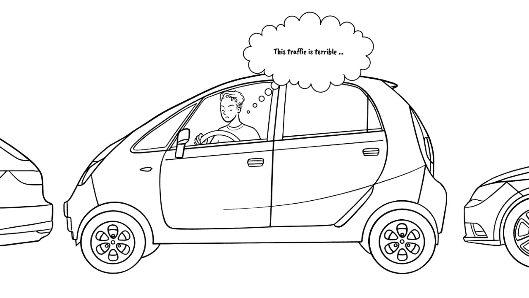
Micheal is driving to a parking silos where he needs to help a costumer.
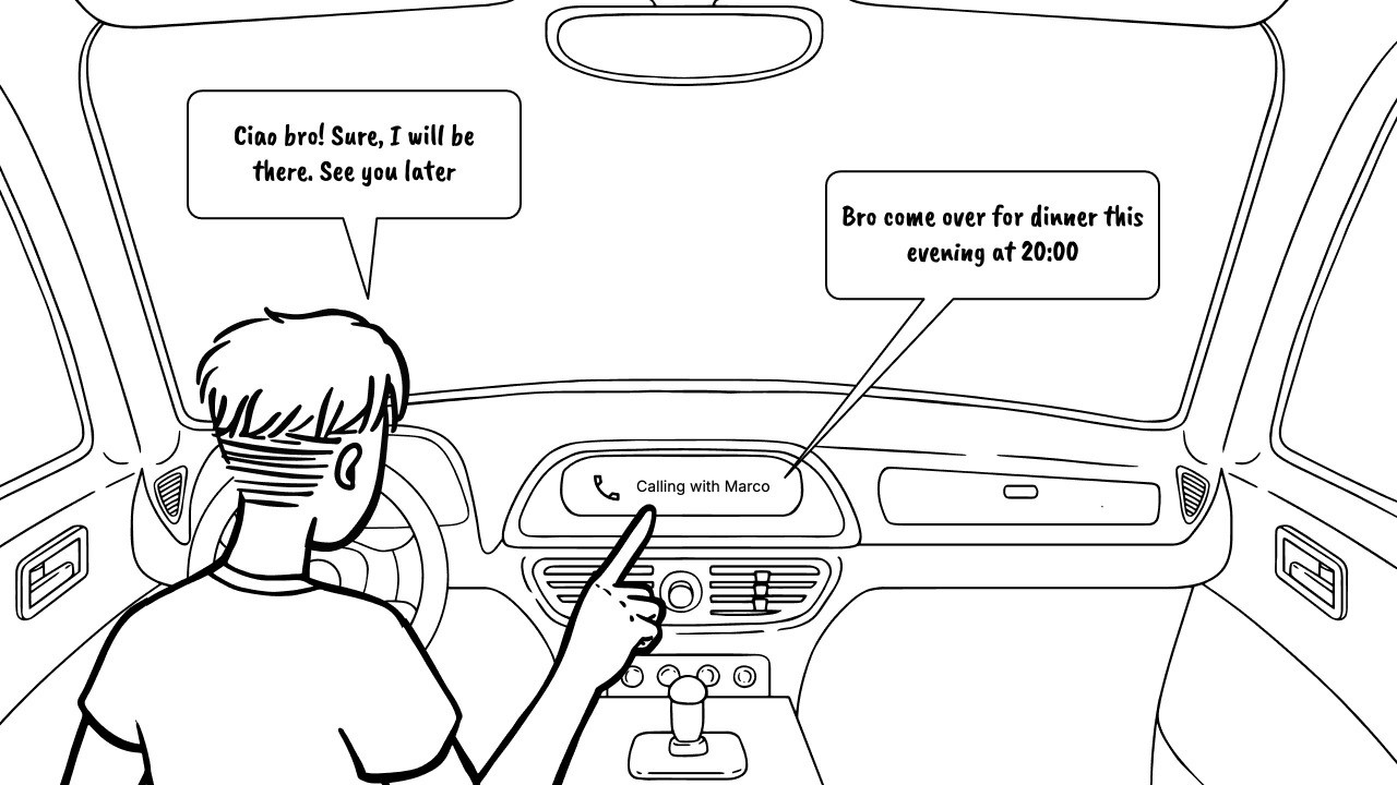
Invited for dinner
A friends call him to invite him for dinner.
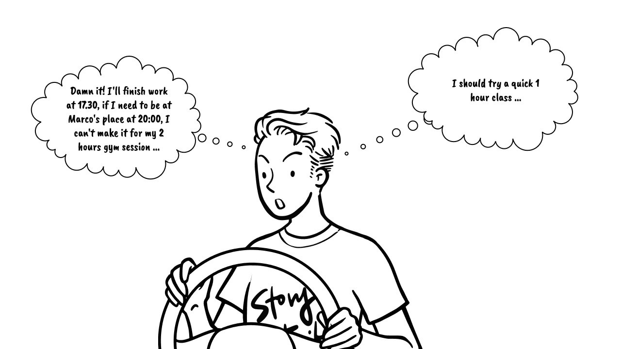
Commitment
He wants to still attend gym for a quick and fulfilled hour.
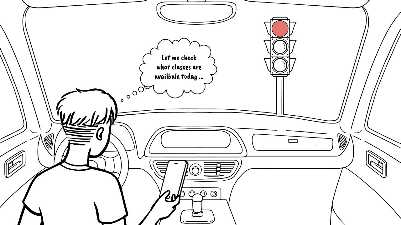
Check availabilities
He checks if there are some available classes that he might like.
Book the class
He navigate the website, but the information are hard to digest.

Pains
Missing clear class details
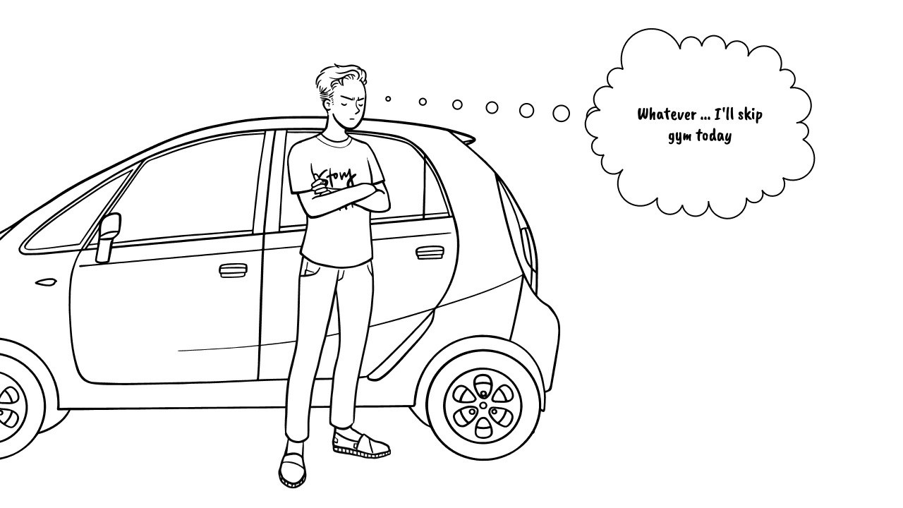
Ending
Micheal can’t complete the task and he decide to skip gym today.

Barrier
Drop off if booking feel like hassle
Scenario
Booking a Class
Becoming a Member
Cancel the Membership
Driving at work
Micheal is driving to a parking silos where he needs to help a costumer.
Invited for dinner
A friends call him to invite him for dinner.
Commitment
He wants to still attend gym for a quick and fulfilled hour.
Check availabilities
He checks if there are some available classes that he might like.
Book the class
He navigate the website, but the information are hard to digest.
Pains
Missing clear class details
Ending
Micheal can’t complete the task and he decide to skip gym today.
Barrier
Drop off if booking feel like hassle
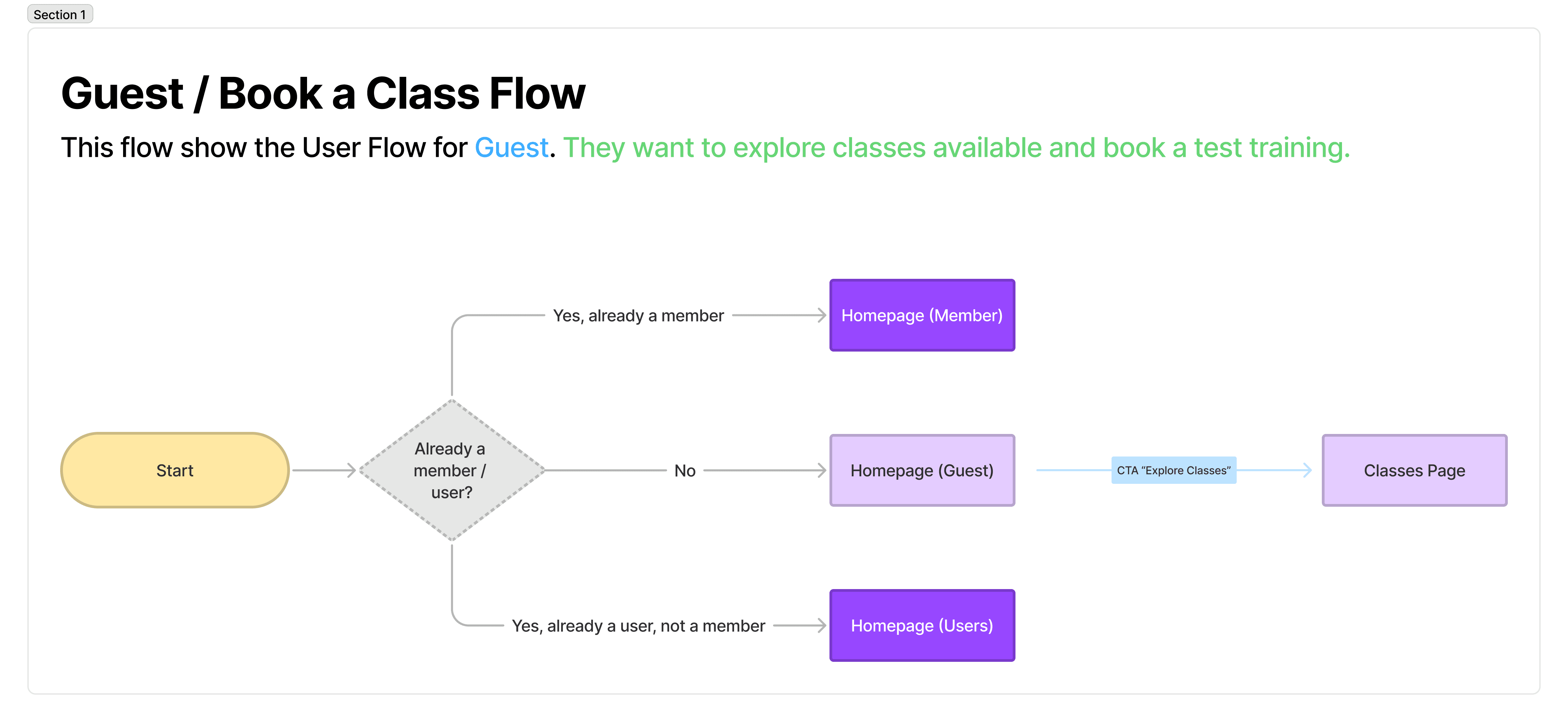
User Flow
While mapping out the two main flows (booking a class and purchasing a membership) I realised that the website actually serves three distinct types of primary users. Defining these user types was essential, as each would require a slightly different UI on key pages such as the homepage and throughout the booking process.
Guest
A person that don’t have an account within the system and they are not member of the gym.
Guest
A person that don’t have an account within the system and they are not member of the gym.
User
A person that have an account within the system but they are not member of the gym.
User
A person that have an account within the system but they are not member of the gym.
Member
A person that have an account within the system and they are member of the gym.
Member
A person that have an account within the system and they are member of the gym.
Design
Design
Homepage
Notes
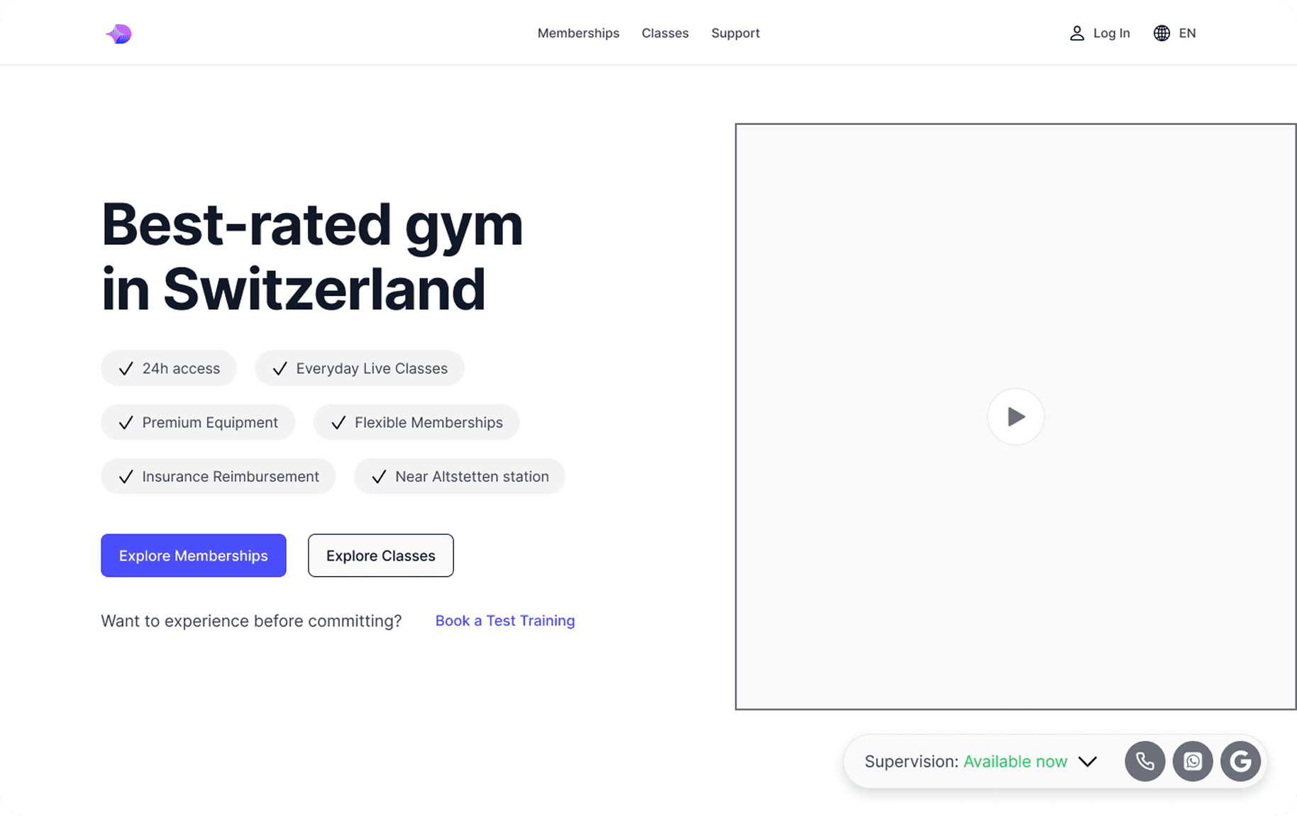
Homepage
Notes
Homepage
Notes
Classes Page
Notes
Homepage
Notes
Pricing Page
Notes
Testing
Testing
Test results
Test results
Participant Overview
1 member (live session)
1 new user (online session)
A special thanks to Arianna & Yves for the time and help by participating in the prototype testing.
Most relevant findings from the usability test
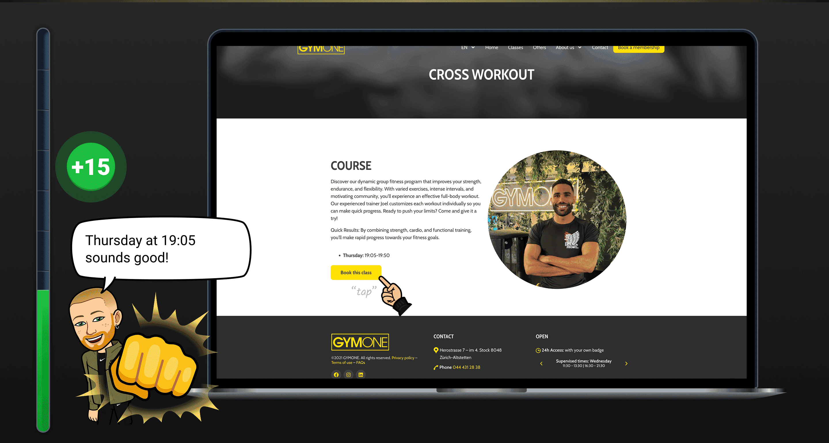
100% Completion Rate
It was observed that 2 out of 2 participants were able to complete the booking flow without any help.
100% Completion Rate
It was observed that 2 out of 2 participants were able to complete the booking flow without any help.
Navigation is Clear
It was observed that 2 out of 2 participants were able to find information and navigate easily across the website.
Navigation is Clear
It was observed that 2 out of 2 participants were able to find information and navigate easily across the website.
Intensity Levels
It was observed that 2 out of 2 participants were confused about the intensity level of each class. They mentioned that they didn’t know what it was referring to and that it should be more specific, for example cardio or weight intensity.
Intensity Levels
It was observed that 2 out of 2 participants were confused about the intensity level of each class. They mentioned that they didn’t know what it was referring to and that it should be more specific, for example cardio or weight intensity.
What Happen Next?
It was observed that 1 out of 2 participants was unsure what to do after having booked a test training. To fill the pit one solution could be to add a guide, for example “What to expect in your first week” or mark the transition with a personalised noted from a personal trainer.
What Happen Next?
It was observed that 1 out of 2 participants was unsure what to do after having booked a test training. To fill the pit one solution could be to add a guide, for example “What to expect in your first week” or mark the transition with a personalised noted from a personal trainer.
“The website navigation is clear and I didn’t lost myself”
“The website navigation is clear and I didn’t lost myself”
Arianna, during prototype testing
Reflection
Reflection
Reflection
The project started as a self-founded project driven by my desire to solved a poor experience I noticed and personally went through. The main challenge was filling the pits created by broken key flows. Today, products are expected to meet a basic standard and satisfy user expectations, especially in a saturated industry like wellness and fitness.
I am happy with the result of my research and the implementation of solution that fixed the issues. I wish I had more time, support and resources to bring these changes into the real world and continue improving the product. For now, this project stands as my strongest research case study. Looking forward to the next challenge.
I am happy with the result of my research and the implementation of solution that fixed the issues. I wish I had more time, support and resources to bring these changes into the real world and continue improving the product. For now, this project stands as my strongest research case study. Looking forward to the next challenge.
Thanks for looking at my case study!
If you have any more questions or want to know more details, please don't hesitate to contact me.
Thanks for looking at my case study!
If you have any more questions or want to know more details, please don't hesitate to contact me.

" height="14.083309999999999px" id="cpA9rMn0C" transform="translate(0 2.96)" width="8.80411px"/><path d="M 0.238 4.745 L 3.204 4.745 L 3.204 14.288 L 0.238 14.288 Z M 1.721 0 C 2.061 0 2.394 0.101 2.677 0.29 C 2.96 0.479 3.18 0.747 3.311 1.061 C 3.441 1.376 3.475 1.721 3.408 2.055 C 3.342 2.388 3.178 2.694 2.937 2.935 C 2.697 3.175 2.39 3.339 2.056 3.405 C 1.723 3.472 1.377 3.437 1.062 3.307 C 0.748 3.177 0.479 2.957 0.29 2.674 C 0.101 2.391 0 2.059 0 1.719 C 0 1.493 0.045 1.27 0.131 1.061 C 0.217 0.853 0.344 0.663 0.504 0.503 C 0.664 0.344 0.854 0.217 1.062 0.131 C 1.271 0.044 1.495 0 1.721 0 Z" fill="rgb(242, 242, 242)" height="14.288229887084963px" id="gvcv3vkMx" transform="translate(9.931 2.749)" width="3.441578922558763px"/><path d="M 0 0 L 2.966 0 L 2.966 8.417 L 6.328 4.532 L 9.965 4.532 L 6.072 8.951 L 9.883 14.084 L 6.155 14.084 L 3.006 9.367 L 2.967 9.367 L 2.967 14.084 L 0.001 14.084 Z" fill="rgb(242, 242, 242)" height="14.084269999999998px" id="Hcxn26Whh" transform="translate(25.544 2.957)" width="9.964999999999996px"/><path d="M 0 0.24 L 2.849 0.24 L 2.849 1.544 L 2.889 1.544 C 3.174 1.057 3.585 0.656 4.08 0.385 C 4.575 0.113 5.134 -0.019 5.698 0.002 C 8.706 0.002 9.26 1.979 9.26 4.548 L 9.26 9.782 L 6.293 9.782 L 6.293 5.142 C 6.293 4.034 6.273 2.61 4.748 2.61 C 3.206 2.61 2.968 3.816 2.968 5.061 L 2.968 9.78 L 0.002 9.78 Z" fill="rgb(242, 242, 242)" height="9.781661901572953px" id="vIBhzUPcy" transform="translate(14.78 7.255)" width="9.259599999999999px"/><path d="M 6.885 3.954 C 6.891 3.713 6.847 3.474 6.758 3.251 C 6.668 3.028 6.534 2.825 6.364 2.655 C 6.194 2.485 5.991 2.351 5.767 2.262 C 5.544 2.173 5.304 2.13 5.064 2.136 C 4.546 2.103 4.035 2.276 3.643 2.616 C 3.251 2.956 3.008 3.437 2.968 3.954 Z M 9.398 8.183 C 8.905 8.78 8.285 9.26 7.584 9.589 C 6.882 9.917 6.116 10.086 5.341 10.082 C 2.375 10.082 0 8.104 0 5.04 C 0 1.977 2.375 0 5.341 0 C 8.114 0 9.852 1.976 9.852 5.04 L 9.852 5.97 L 2.968 5.97 C 3.053 6.497 3.327 6.975 3.737 7.316 C 4.148 7.658 4.669 7.839 5.203 7.828 C 5.625 7.825 6.04 7.717 6.41 7.513 C 6.78 7.31 7.093 7.017 7.32 6.661 Z" fill="rgb(242, 242, 242)" height="10.081772872122011px" id="AE1PfViz5" transform="translate(34.871 7.202)" width="9.8525px"/><path d="M 5.342 6.844 C 3.859 6.844 2.969 7.834 2.969 9.275 C 2.969 10.717 3.858 11.707 5.342 11.707 C 6.825 11.707 7.717 10.719 7.717 9.275 C 7.717 7.831 6.827 6.844 5.342 6.844 Z M 10.448 14.079 L 7.717 14.079 L 7.717 12.814 L 7.677 12.814 C 7.334 13.274 6.89 13.649 6.378 13.91 C 5.867 14.17 5.302 14.31 4.728 14.316 C 1.877 14.316 0 12.261 0 9.355 C 0 6.686 1.661 4.236 4.393 4.236 C 5.62 4.236 6.767 4.571 7.44 5.501 L 7.479 5.501 L 7.479 0 L 10.448 0 Z" fill="rgb(242, 242, 242)" height="14.3164px" id="NJ8wolRAB" transform="translate(45.565 2.957)" width="10.447900000000004px"/><path d="M 17.058 17.041 L 14.092 17.041 L 14.092 12.4 C 14.092 11.294 14.072 9.869 12.549 9.869 C 11.004 9.869 10.767 11.075 10.767 12.32 L 10.767 17.041 L 7.801 17.041 L 7.801 7.497 L 10.649 7.497 L 10.649 8.802 L 10.689 8.802 C 10.974 8.315 11.385 7.914 11.88 7.643 C 12.375 7.371 12.934 7.239 13.498 7.26 C 16.505 7.26 17.059 9.236 17.059 11.806 Z M 4.454 6.193 C 4.114 6.193 3.781 6.092 3.498 5.903 C 3.215 5.714 2.994 5.446 2.864 5.132 C 2.733 4.817 2.699 4.472 2.765 4.138 C 2.832 3.804 2.996 3.498 3.236 3.257 C 3.477 3.017 3.784 2.853 4.118 2.786 C 4.452 2.72 4.798 2.754 5.112 2.884 C 5.427 3.014 5.696 3.235 5.885 3.517 C 6.074 3.8 6.175 4.133 6.175 4.473 C 6.175 4.699 6.131 4.922 6.044 5.131 C 5.958 5.34 5.831 5.529 5.671 5.689 C 5.511 5.849 5.322 5.975 5.113 6.062 C 4.904 6.148 4.68 6.193 4.454 6.193 Z M 5.937 17.041 L 2.968 17.041 L 2.968 7.497 L 5.937 7.497 Z M 18.537 0.001 L 1.477 0.001 C 1.09 -0.003 0.717 0.146 0.44 0.417 C 0.163 0.687 0.005 1.056 0 1.443 L 0 18.557 C 0.005 18.944 0.163 19.313 0.44 19.584 C 0.717 19.854 1.09 20.004 1.477 20 L 18.537 20 C 18.925 20.005 19.299 19.856 19.577 19.585 C 19.855 19.314 20.015 18.945 20.02 18.557 L 20.02 1.442 C 20.014 1.054 19.855 0.685 19.577 0.414 C 19.299 0.144 18.925 -0.005 18.537 0" fill="rgb(242, 242, 242)" height="20.00001233179293px" id="h0ASzJBqY" transform="translate(58.98 0)" width="20.0199px"/></svg>)

" width="32px"><path d="M 0 18 L 0 0 L 32 0 L 32 18 Z" fill="transparent" height="18px" id="Jy2pjMPxh" width="32px"/><path d="M 30.764 4.272 C 29.333 1.632 26.57 0 23.564 0 L 0.776 0 C 0.339 0 0 0.36 0 0.792 C 0 0.984 0.073 1.2 0.218 1.344 L 5.188 6.288 C 5.624 6.72 6.23 6.96 6.836 6.96 L 22.909 6.96 C 24.049 6.96 24.994 7.848 24.994 9 C 24.994 10.128 24.097 11.064 22.933 11.064 L 11.879 11.064 C 11.442 11.064 11.103 11.424 11.103 11.856 C 11.103 12.072 11.176 12.264 11.321 12.408 L 16.291 17.352 C 16.727 17.76 17.333 18 17.939 18 L 22.958 18 C 29.479 18 34.4 11.112 30.764 4.272 Z" fill="rgb(242, 242, 242)" height="18px" id="H7dF85Ca_" width="31.999776707293517px"/></g><path d="M 0 14 L 0 0 L 4.7 0 C 6.033 0 7.26 0.32 8.38 0.96 C 9.5 1.587 10.38 2.44 11.02 3.52 C 11.673 4.587 12 5.747 12 7 C 12 8.253 11.673 9.42 11.02 10.5 C 10.38 11.567 9.5 12.42 8.38 13.06 C 7.26 13.687 6.033 14 4.7 14 Z M 4.7 12 C 5.647 12 6.507 11.78 7.28 11.34 C 8.067 10.9 8.68 10.3 9.12 9.54 C 9.573 8.767 9.8 7.92 9.8 7 C 9.8 6.08 9.573 5.24 9.12 4.48 C 8.68 3.707 8.067 3.1 7.28 2.66 C 6.507 2.22 5.647 2 4.7 2 L 2.2 2 L 2.2 12 Z M 18.198 4.2 C 18.984 4.2 19.678 4.36 20.278 4.68 C 20.891 5 21.364 5.447 21.698 6.02 C 22.031 6.58 22.198 7.207 22.198 7.9 L 22.198 14 L 20.298 14 L 20.298 12.64 L 20.278 12.64 C 20.024 13.04 19.611 13.4 19.038 13.72 C 18.464 14.04 17.831 14.2 17.138 14.2 C 16.511 14.2 15.951 14.073 15.458 13.82 C 14.964 13.567 14.578 13.227 14.298 12.8 C 14.031 12.36 13.898 11.893 13.898 11.4 C 13.898 10.6 14.158 9.933 14.678 9.4 C 15.211 8.867 15.951 8.52 16.898 8.36 L 20.198 7.8 L 20.198 7.76 C 20.198 7.267 20.004 6.853 19.618 6.52 C 19.244 6.173 18.771 6 18.198 6 C 17.678 6 17.218 6.12 16.818 6.36 C 16.418 6.587 16.038 6.893 15.678 7.28 L 14.398 6.04 C 15.451 4.813 16.718 4.2 18.198 4.2 Z M 17.498 12.5 C 17.991 12.5 18.444 12.38 18.858 12.14 C 19.271 11.887 19.598 11.547 19.838 11.12 C 20.078 10.693 20.198 10.22 20.198 9.7 L 20.198 9.4 L 17.398 9.9 C 16.918 9.993 16.544 10.16 16.278 10.4 C 16.024 10.627 15.898 10.893 15.898 11.2 C 15.898 11.56 16.044 11.867 16.338 12.12 C 16.631 12.373 17.018 12.5 17.498 12.5 Z M 27.988 14.2 C 27.162 14.2 26.408 14.02 25.728 13.66 C 25.048 13.287 24.535 12.867 24.188 12.4 L 25.488 11.1 C 25.768 11.433 26.135 11.733 26.588 12 C 27.042 12.267 27.515 12.4 28.008 12.4 C 28.542 12.4 28.955 12.287 29.248 12.06 C 29.542 11.833 29.688 11.553 29.688 11.22 C 29.688 10.927 29.535 10.7 29.228 10.54 C 28.935 10.367 28.468 10.187 27.828 10 C 27.162 9.8 26.608 9.6 26.168 9.4 C 25.742 9.2 25.368 8.907 25.048 8.52 C 24.742 8.133 24.588 7.627 24.588 7 C 24.588 6.493 24.728 6.027 25.008 5.6 C 25.288 5.173 25.695 4.833 26.228 4.58 C 26.762 4.327 27.382 4.2 28.088 4.2 C 28.848 4.2 29.522 4.333 30.108 4.6 C 30.708 4.867 31.168 5.167 31.488 5.5 L 30.188 6.8 C 29.962 6.587 29.662 6.4 29.288 6.24 C 28.915 6.08 28.515 6 28.088 6 C 27.622 6 27.255 6.1 26.988 6.3 C 26.722 6.5 26.588 6.733 26.588 7 C 26.588 7.293 26.728 7.52 27.008 7.68 C 27.302 7.827 27.775 8 28.428 8.2 C 29.108 8.4 29.662 8.6 30.088 8.8 C 30.528 9 30.902 9.293 31.208 9.68 C 31.528 10.067 31.688 10.573 31.688 11.2 C 31.688 11.733 31.535 12.233 31.228 12.7 C 30.935 13.153 30.508 13.52 29.948 13.8 C 29.388 14.067 28.735 14.2 27.988 14.2 Z M 33.992 14 L 33.992 0 L 35.992 0 L 35.992 5.76 L 36.012 5.76 C 36.266 5.36 36.659 5 37.192 4.68 C 37.739 4.36 38.339 4.2 38.992 4.2 C 39.726 4.2 40.379 4.373 40.952 4.72 C 41.526 5.053 41.972 5.54 42.292 6.18 C 42.626 6.807 42.792 7.547 42.792 8.4 L 42.792 14 L 40.792 14 L 40.792 8.4 C 40.792 7.707 40.586 7.153 40.172 6.74 C 39.772 6.313 39.246 6.1 38.592 6.1 C 37.832 6.1 37.206 6.353 36.712 6.86 C 36.232 7.353 35.992 8 35.992 8.8 L 35.992 14 Z M 46.094 14 L 46.094 0 L 51.694 0 C 52.574 0 53.374 0.2 54.094 0.6 C 54.814 1 55.374 1.547 55.774 2.24 C 56.187 2.92 56.394 3.673 56.394 4.5 C 56.394 5.327 56.187 6.087 55.774 6.78 C 55.374 7.46 54.814 8 54.094 8.4 C 53.374 8.8 52.574 9 51.694 9 L 48.294 9 L 48.294 14 Z M 51.694 7 C 52.401 7 52.994 6.76 53.474 6.28 C 53.954 5.787 54.194 5.193 54.194 4.5 C 54.194 3.793 53.954 3.2 53.474 2.72 C 52.994 2.24 52.401 2 51.694 2 L 48.294 2 L 48.294 7 Z M 61.596 4.2 C 62.382 4.2 63.076 4.36 63.676 4.68 C 64.289 5 64.762 5.447 65.096 6.02 C 65.429 6.58 65.596 7.207 65.596 7.9 L 65.596 14 L 63.696 14 L 63.696 12.64 L 63.676 12.64 C 63.422 13.04 63.009 13.4 62.436 13.72 C 61.863 14.04 61.23 14.2 60.536 14.2 C 59.91 14.2 59.35 14.073 58.856 13.82 C 58.363 13.567 57.976 13.227 57.696 12.8 C 57.43 12.36 57.296 11.893 57.296 11.4 C 57.296 10.6 57.556 9.933 58.076 9.4 C 58.61 8.867 59.35 8.52 60.296 8.36 L 63.596 7.8 L 63.596 7.76 C 63.596 7.267 63.402 6.853 63.016 6.52 C 62.642 6.173 62.169 6 61.596 6 C 61.076 6 60.616 6.12 60.216 6.36 C 59.816 6.587 59.436 6.893 59.076 7.28 L 57.796 6.04 C 58.85 4.813 60.116 4.2 61.596 4.2 Z M 60.896 12.5 C 61.39 12.5 61.843 12.38 62.256 12.14 C 62.669 11.887 62.996 11.547 63.236 11.12 C 63.476 10.693 63.596 10.22 63.596 9.7 L 63.596 9.4 L 60.796 9.9 C 60.316 9.993 59.943 10.16 59.676 10.4 C 59.423 10.627 59.296 10.893 59.296 11.2 C 59.296 11.56 59.443 11.867 59.736 12.12 C 60.03 12.373 60.416 12.5 60.896 12.5 Z M 71.386 14.2 C 70.56 14.2 69.806 14.02 69.126 13.66 C 68.446 13.287 67.933 12.867 67.586 12.4 L 68.886 11.1 C 69.166 11.433 69.533 11.733 69.986 12 C 70.44 12.267 70.913 12.4 71.406 12.4 C 71.94 12.4 72.353 12.287 72.646 12.06 C 72.94 11.833 73.086 11.553 73.086 11.22 C 73.086 10.927 72.933 10.7 72.626 10.54 C 72.333 10.367 71.866 10.187 71.226 10 C 70.56 9.8 70.006 9.6 69.566 9.4 C 69.14 9.2 68.766 8.907 68.446 8.52 C 68.14 8.133 67.986 7.627 67.986 7 C 67.986 6.493 68.126 6.027 68.406 5.6 C 68.686 5.173 69.093 4.833 69.626 4.58 C 70.16 4.327 70.78 4.2 71.486 4.2 C 72.246 4.2 72.92 4.333 73.506 4.6 C 74.106 4.867 74.566 5.167 74.886 5.5 L 73.586 6.8 C 73.36 6.587 73.06 6.4 72.686 6.24 C 72.313 6.08 71.913 6 71.486 6 C 71.02 6 70.653 6.1 70.386 6.3 C 70.12 6.5 69.986 6.733 69.986 7 C 69.986 7.293 70.126 7.52 70.406 7.68 C 70.7 7.827 71.173 8 71.826 8.2 C 72.506 8.4 73.06 8.6 73.486 8.8 C 73.926 9 74.3 9.293 74.606 9.68 C 74.926 10.067 75.086 10.573 75.086 11.2 C 75.086 11.733 74.933 12.233 74.626 12.7 C 74.333 13.153 73.906 13.52 73.346 13.8 C 72.786 14.067 72.133 14.2 71.386 14.2 Z M 80.39 14.2 C 79.564 14.2 78.81 14.02 78.13 13.66 C 77.45 13.287 76.937 12.867 76.59 12.4 L 77.89 11.1 C 78.17 11.433 78.537 11.733 78.99 12 C 79.444 12.267 79.917 12.4 80.41 12.4 C 80.944 12.4 81.357 12.287 81.65 12.06 C 81.944 11.833 82.09 11.553 82.09 11.22 C 82.09 10.927 81.937 10.7 81.63 10.54 C 81.337 10.367 80.87 10.187 80.23 10 C 79.564 9.8 79.01 9.6 78.57 9.4 C 78.144 9.2 77.77 8.907 77.45 8.52 C 77.144 8.133 76.99 7.627 76.99 7 C 76.99 6.493 77.13 6.027 77.41 5.6 C 77.69 5.173 78.097 4.833 78.63 4.58 C 79.164 4.327 79.784 4.2 80.49 4.2 C 81.25 4.2 81.924 4.333 82.51 4.6 C 83.11 4.867 83.57 5.167 83.89 5.5 L 82.59 6.8 C 82.364 6.587 82.064 6.4 81.69 6.24 C 81.317 6.08 80.917 6 80.49 6 C 80.024 6 79.657 6.1 79.39 6.3 C 79.124 6.5 78.99 6.733 78.99 7 C 78.99 7.293 79.13 7.52 79.41 7.68 C 79.704 7.827 80.177 8 80.83 8.2 C 81.51 8.4 82.064 8.6 82.49 8.8 C 82.93 9 83.304 9.293 83.61 9.68 C 83.93 10.067 84.09 10.573 84.09 11.2 C 84.09 11.733 83.937 12.233 83.63 12.7 C 83.337 13.153 82.91 13.52 82.35 13.8 C 81.79 14.067 81.137 14.2 80.39 14.2 Z" fill="rgb(242, 242, 242)" height="14.199999809265137px" id="DJ4NzwBI4" transform="translate(38.053 2)" width="84.09030151367188px"/></svg>)
